Every retailer knows Saturdays are busier than Tuesdays. That’s not the insight. The insight is which Tuesdays are quietly stronger than they look, which Saturdays are softer than the brand-wide average suggests, and which locations have weekly patterns that don’t match the rest of the business.
Day of week patterns in retail are one of the most underused signals in retail operations across multiple locations. Most retailers track them, in the sense that they show up on a weekly report. Very few use them to make decisions. The pattern sits in the dashboard, gets glanced at, and gets ignored, because the report shows the pattern but doesn’t tell anyone what to do about it.
This article is about how to actually use day of week patterns in retail: what to look for, what to compare, and which decisions the patterns should drive across staffing, inventory, marketing, and store-level performance management.
What day of week patterns in retail actually show
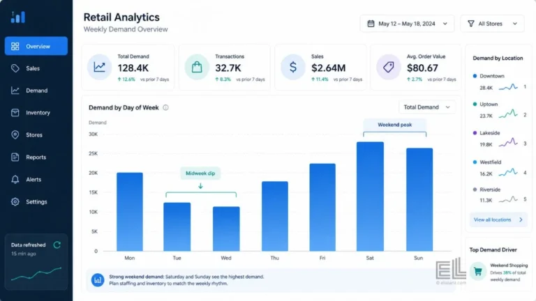
A weekly pattern is the consistent rhythm of customer behaviour across the seven days of a typical week. For most retailers, Saturday is the peak. Sunday is usually second. Tuesday or Wednesday is usually the trough. The exact shape depends on the category: grocery is flatter than fashion, convenience is flatter than electronics, and category killers like home improvement skew harder toward weekends than supermarkets do.
Industry reporting from outlets like Retail Dive consistently shows that weekly demand rhythm varies sharply by category and store format, with destination shopping formats skewing harder to weekends than convenience led ones.
But the average shape of the week isn’t what matters operationally. What matters is the variation around the shape. A specific location that overperforms on Wednesdays compared to the chain average is telling you something. A category that punches above its weight on Sundays is telling you something else. The day of week patterns in retail are most useful when you stop looking at the headline rhythm and start looking at where the rhythm doesn’t match.
This is the trap most retailers fall into with weekly pattern analysis. They look at the chain wide weekly chart, confirm what they already knew, weekends are stronger, and move on. The chain wide chart is the average. The action lives in the deviations from it.
The four comparisons that turn the pattern into decisions
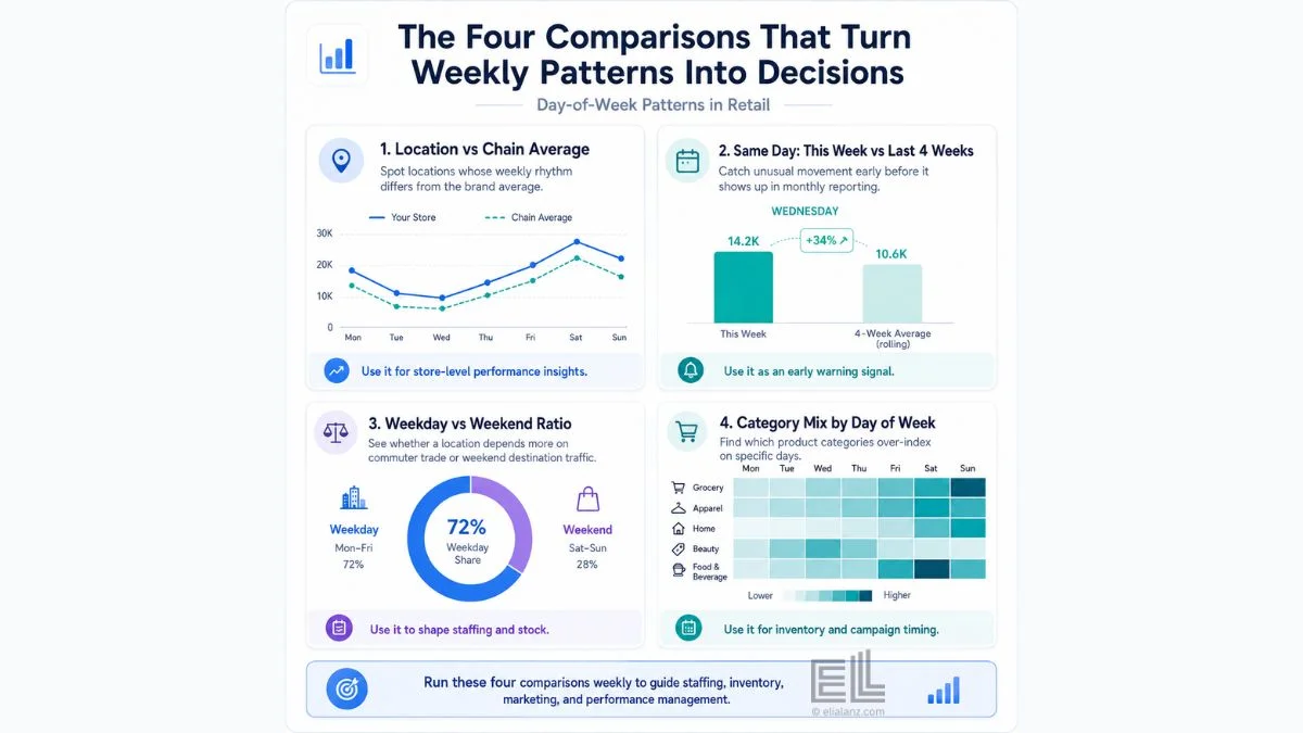
Day of week patterns in retail become useful for decisions when you make four specific comparisons. Each one answers a different operational question.
Comparison one: location vs chain average.
Take each location and plot its weekly rhythm against the chain wide average. The locations whose patterns match the chain are operating in line with expectation. The locations whose patterns diverge are the ones with something specific going on: a store that is strongest on Thursday when the chain peaks on Saturday, or a store with no weekend lift at all. That “something” might be local foot traffic patterns, the surrounding tenant mix, weekday office worker density, or a category mix that doesn’t match the brand. Whatever it is, the deviation is the lead. The chain average is the comparison that surfaces it.
Comparison two: same day, this week vs last four weeks.
For each location, compare this Wednesday to the average of the last four Wednesdays. This is the early warning comparison. A Wednesday that is 12% below the recent Wednesday average is not a small variation. It is a signal. Maybe a competitor just opened. Maybe the local employer cut shifts. Maybe a key product is out of stock. Whatever the cause, the same day comparison catches the change weeks before the monthly report would.
Comparison three: weekday vs weekend ratio.
Calculate, for each location, the ratio of weekday sales to weekend sales. Locations with high weekday share are usually serving office workers, regulars, or commuter flow. Locations with high weekend share are usually destination shopping, family trips, or leisure visits. These two profiles need different staffing schedules, different inventory levels, and different marketing rhythms. Treating them the same is one of the most common mistakes across multi location operations.
Comparison four: category mix by weekday.
Within a single location, look at which categories index high on which days. Fresh produce peaks differently from frozen, even in the same store. Workwear sells differently on weekdays than weekends. Looking at category mix inside the day of week patterns in retail is how you find the inventory and marketing decisions that the location level chart misses.
These four comparisons cover most of the operational value in day of week patterns in retail. You don’t need more analysis than this. You need to actually run these four comparisons every week, and assign someone to act on what they show.
Why most retailers don’t use day of week patterns this way
Two reasons.
The first is reporting structure. Most retail reporting runs on a monthly cycle. Weekly patterns get aggregated up to a monthly view, the variation gets averaged out, and the day level signal disappears before anyone reads it. By the time the monthly report lands, the operator can see that Wednesdays were soft across the month, but they can’t see which Wednesdays or which locations, so there’s no decision to make.
The second reason is staffing. Acting on these weekly patterns requires someone to look at the data every week, identify the deviations, and trigger a specific operational response. That role usually doesn’t exist. Operations directors are busy with bigger fires. Store managers don’t have a chain wide view. Analysts produce the reports but aren’t authorised to act on them. So the day of week patterns in retail sit visible in the dashboard and unused in the operation.
This is the same problem that shows up in every multi location analytics conversation. The deeper problem of averages destroying multi location operations covers this in detail: day of week patterns in retail are one of the most concrete examples of where the averaging hides what matters.
What real retail data looks like when you actually map this
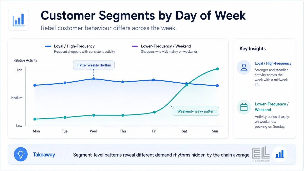
In the customer segmentation work I did on a retail dataset with multiple locations, 206,000 customers, and 32.4 million transactions across the dataset window, the weekly rhythm was not uniform across customer segments. Loyal high frequency segments had a flatter weekly pattern, with strong midweek activity. Lower frequency segments concentrated almost entirely on weekends. The weekly chart across the whole chain hid this completely because it averaged both groups together.
That’s the lived version of the point above. The chain wide pattern told one story. The segmented pattern told a different one, and a more useful one for decisions about which campaigns to send on which days, which inventory to stock for which customers, and which staffing to schedule for which footfall profile. The retail customer segmentation case study walks through how the segments were built and what the operational moves looked like.
The day of week patterns in retail get more useful, not less, when you slice the data by customer type, category, or location. The aggregate hides the action. The segment shows it.
The decisions these patterns should be driving
Once the four comparisons are running weekly, the decisions they enable are operational rather than strategic: quick to make, easy to test, and hard to argue with.
Staffing. The clearest use. Locations whose weekly pattern peaks differently from the chain average shouldn’t be staffed on the chain average template. A store that performs strongly on Thursdays needs more staff cover on Thursdays. The day level pattern, location by location, should drive the staffing template, not the regional manager’s intuition about what a “typical” week looks like.
Inventory. Replenishment cycles should match the actual demand rhythm of each location. A store with a strong weekday lift in fresh categories needs a different delivery rhythm from a store that does most of its business on weekends. Most chains run a single replenishment cadence across all locations. The day of week patterns in retail tell you which locations need a different cadence.
Marketing. Email and promotional timing should match the weekday profile of the target segment. If high value customers in a city skew midweek, midweek is when the campaign goes out. If the suburban locations skew weekend, weekend is when the promotion runs. National campaigns sent at uniform times leave a lot of conversion on the table for retailers with mixed location profiles.
Performance management. Comparing locations against each other on a Saturday vs Saturday basis, or a Wednesday vs Wednesday basis, is far more diagnostic than comparing them on monthly totals. Day of week patterns in retail make underperformance visible weeks earlier than monthly reporting does. The piece on spotting a slow declining store early covers the related diagnostic pattern.
What the dashboard needs to support this
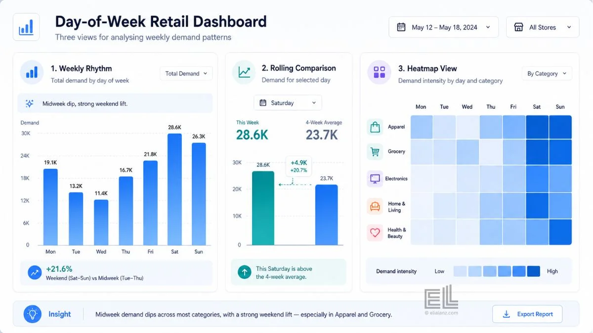
A dashboard that surfaces day of week patterns in retail in a way operators will actually use has three views.
The first view shows the day of week patterns in retail by location. Each location’s seven day shape, plotted against the chain average. Operators can scan this and immediately spot the locations whose patterns don’t match the brand.
The second view is the rolling four week comparison. For each day of the week, this location’s current performance against its own rolling average. This surfaces deviations week by week without waiting for a monthly close.
The third view is the weekday heatmap by category or segment. This is the deeper layer: which categories and customer types are driving demand on specific days at specific locations. This is where the inventory and marketing decisions get made.
That’s enough. Most dashboards trying to surface these patterns try to do too much. Three views, refreshed weekly, with someone responsible for acting on what they show, will outperform a fifteen panel weekly report every time.
If you want to build this kind of dashboard for your own operation, the dashboard service I offer is designed for exactly this kind of work: retailers with multiple locations who already have the data but cannot get the weekly view they need from existing reporting. Or explore the other ways I work with retailers if the dashboard isn’t quite the right starting point.
The shift that makes the pattern useful
Day of week patterns in retail aren’t a new idea. Every retailer has the data. Most retailers have the chart. What’s missing is the operational habit of looking at the weekly rhythm at the location level, week after week, and making small adjustments based on what it shows.
That’s the shift. It’s not analytical. It’s operational discipline. Run the four comparisons weekly. Assign someone to act on the deviations. Adjust staffing, inventory, marketing, and performance management based on the patterns. The data is already there. The decisions are the work.
The retailers I see pulling away from their peers aren’t the ones with better analytics. They’re the ones who built the habit of using the day of week patterns in retail they already had in their reporting. Day of week patterns are one of the cleanest places to start, because the comparisons are simple, the decisions are concrete, and the feedback loop is weekly.
Elia Lanzuise builds custom operational dashboards for businesses with hidden demand patterns, multi location retail, transport and logistics, booking based services, e-commerce, and hospitality. The work starts with the decisions you need to make, not the charts.
See how the dashboard service works → or explore other data services if you’re not sure what you need.
Pingback: Multi Store Retail Analytics: A Proven Framework
Pingback: Slow Declining Store Warning Signs Before the P&L