
You spent good money on it. Maybe you built it in-house, or maybe you hired someone. Either way, the dashboard exists. It works. The numbers are right. And nobody is using it.
You can tell because nothing has changed. The same problems still come up in Monday meetings. The same questions still get asked. Decisions are still being made off gut feel, off the same monthly report nobody trusts, off whatever the loudest manager said last week. The dashboard is sitting there like a gym membership. Dashboard adoption is the missing piece, and it’s almost never about the dashboard itself.
This is one of the most common patterns I see in operations work. A business pays to get visibility into its own numbers, and then the team quietly goes back to doing things the old way. The dashboard becomes a graveyard for data that should have changed how the business runs.
Good dashboard adoption is not about the dashboard. It’s about everything around it. Here’s what’s actually going wrong on the ground, and what to do about it.
The Dashboard Answers Questions Nobody Is Asking
This is the biggest one by a long way.
Most dashboards get built around what’s easy to measure, not around what people actually need to decide. The result is a screen full of KPIs that look impressive but don’t help anyone do their job better on a Tuesday afternoon.
One pattern I see often: the dashboard is built entirely on lagging indicators, so it tells the team what already happened but not what to do this week.
Your shift manager doesn’t care about year-over-year revenue growth. She cares about whether she should send someone home early because foot traffic is slow. Your warehouse lead doesn’t care about quarterly trends. He cares about whether tomorrow’s deliveries are going to clash with stock arrivals. These are operational decisions, made every day, by people who don’t have time to interpret charts.
Strong dashboard adoption starts with building the dashboard backwards from those decisions. You start with “what does this person need to decide today?” and only then figure out which numbers show up on the screen. If you skip that step, you end up with a dashboard that’s technically correct and practically useless.
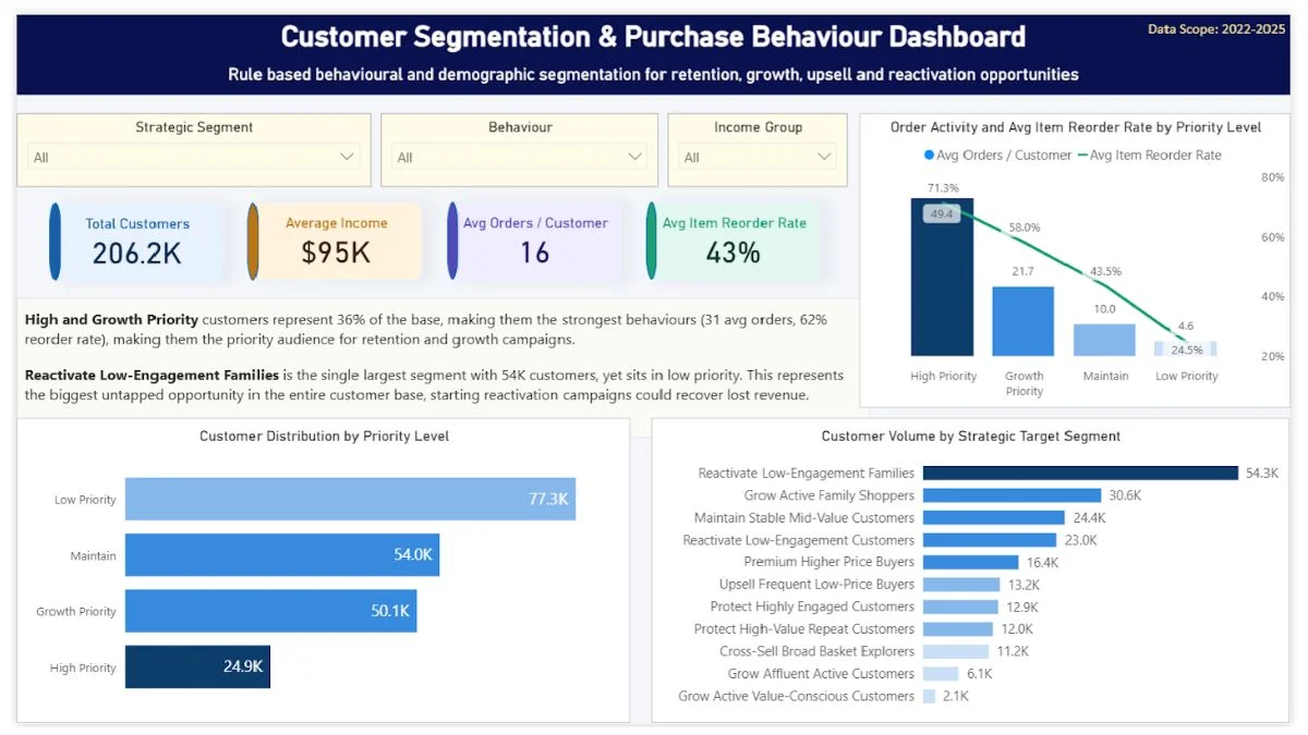
When I built a customer segmentation dashboard for a retail analytics case study, the design started from a single business question: which customers should the commercial team protect, grow, upsell, cross-sell, reactivate, or monitor? That question shaped every layer of the build. The final dashboard ended up with 11 customer segments, but instead of calling them “Cluster A” or “Group 3,” every segment had a name that told the team what to do: Protect High Value Repeat Customers, Grow Active Family Shoppers, Reactivate Low Engagement Families.
A campaign manager opening that dashboard could pick a segment and know what action it implied. That’s the difference between a dashboard that gets used and one that gets ignored. The data was the same data any retailer has. The decisions baked into the segment names were the reason the dashboard had a purpose.
The fix: Before anyone touches the data, sit down with the people who’ll use it and write down the five decisions they make each week. Then build the dashboard to answer those five questions, in that order. Anything that doesn’t help with one of those decisions gets cut. Yes, even the charts that look nice.
It Takes More Than 10 Seconds To Find The Answer
Operators don’t read dashboards. They glance at them.
If your dashboard requires someone to scroll, filter, click through a tab, and then mentally cross-reference two charts before they get an answer, it won’t survive contact with a real workday. Dashboard adoption depends on speed, and speed only happens when the answer is one glance away. Your team has 30 seconds between phone calls. They need the answer on the screen, big, obvious, and visible at first glance.
I’ve seen dashboards with twelve KPI cards across the top, three filters, two date pickers, and a tabbed navigation. The person who built it called it “comprehensive.” The team called it “that thing nobody opens.”
Good dashboard adoption means the most important number is the biggest thing on the screen. The second most important number is the second biggest. And so on. If everything is equally important, nothing is.
The fix: Pick one number per dashboard page that is the “headline.” Make it three times bigger than everything else. Build the rest of the page to explain that one number, why it’s up, why it’s down, what to do about it.
The Data Isn’t Trusted
If a team member opens the dashboard, sees a number that doesn’t match what they know on the ground, and there’s no way to dig into it, they’ll stop opening the dashboard. Once. That’s all it takes.
Maybe the date range is wrong. Maybe a store is missing from the rollup. Maybe last week’s promo isn’t accounted for. Doesn’t matter, the trust is gone, and rebuilding trust in numbers is much harder than building it in the first place. Dashboard adoption can survive a slow rollout, but it almost never survives a credibility hit. McKinsey’s research on analytics adoption found that low data quality was the single biggest reason employees stop using data to make decisions, which is the same problem in different words.
This is why data cleaning matters more than chart design. A dashboard that’s 95% accurate is worse than no dashboard at all, because the 5% errors will be exactly the ones your team notices first. Operators have a sixth sense for numbers that don’t match their daily experience.
The fix: Be honest about what the dashboard does and doesn’t cover. Add a small note next to each chart saying where the data comes from and when it was last updated. If something’s an estimate, say so. If a metric excludes certain transactions, say so. Treat your team like adults who can handle caveats.
Nobody Showed Them What To Do With It
This sounds obvious. It isn’t.
Most dashboards get rolled out with a five-minute walkthrough. Sometimes not even that. The person who built it shows the team the tabs, the filters, the charts. Everyone nods. Then the dashboard goes live and the team is expected to just figure out how to integrate it into their working week.
That’s not how habits form. Good dashboard adoption needs a clear ritual around the dashboard, not just access to it. A weekly check-in where the manager opens the dashboard with the team and walks through what changed. A standing question in the Monday meeting that can only be answered by looking at the dashboard. A specific KPI threshold that triggers a specific action.
Without a ritual, dashboard adoption stalls and the dashboard becomes just another browser tab nobody opens.
The fix: Pick one recurring meeting and make the dashboard the agenda. Not a side reference, the actual agenda. The first ten minutes are spent looking at the dashboard together and deciding what to do about what’s shown. Do this for four weeks and adoption sticks. Skip it and adoption dies.
The Dashboard Punishes Them For Using It
If looking at the dashboard makes someone’s job harder, they won’t look at it.
This happens more often than you’d think. A regional manager opens the dashboard, sees that her location is underperforming, and now she has to spend Tuesday afternoon explaining it to head office. Of course she stops opening it. Why would she look at something that creates more work for her than it solves? Dashboard adoption collapses fast when the people closest to the work feel watched instead of supported.
Dashboard adoption fails fast when the dashboard becomes a surveillance tool instead of a decision support tool. The people closest to the work need to feel like the dashboard is helping them, not exposing them. If they see it as a way for the boss to catch them out, they’ll quietly route around it.
The fix: Make the first conversation about a bad number a problem-solving conversation, not a blame conversation. If staff see the dashboard being used to help fix things rather than to punish people, they’ll use it themselves. If they see it being used as a stick, it’ll become invisible within a month.
It Doesn’t Fit How The Team Actually Works
Some teams live in Excel. Some live in WhatsApp. Some live in their POS system. Some open one tab and never close it.
If your dashboard requires people to log into a new system, remember a separate password, find a bookmark, and switch out of whatever they’re currently doing, most of them won’t. Even if the dashboard is brilliant. Even if it would save them hours.
The friction of “where do I go to see this” kills more dashboards than bad design ever has. Dashboard adoption isn’t a design problem at this point — it’s a workflow problem. Your team’s existing workflow has gravity. A new tool either rides that gravity or fights it. Fighting it almost always loses.
The fix: Put the dashboard where the team already goes. If everyone lives in Slack, push key numbers into a daily Slack message. If they live in email, send a Monday morning summary that links to the full dashboard. If they live in the POS, embed the dashboard into the back office. The dashboard has to come to them, not the other way around.
Custom dashboards are one of several data services I offer, see the full list here if you’re not sure which fits your situation.

The Original Problem Wasn’t A Dashboard Problem
This one stings, but it’s worth saying.
Sometimes the dashboard doesn’t get used because it was the wrong solution to the wrong problem. The business needed a process change, a staffing change, a training change, or a communication change, and someone said “let’s build a dashboard.” The dashboard got built. The underlying problem didn’t move.
When I work with operators who’ve had a dashboard sitting unused for months, I usually find the same thing: nobody ever wrote down what decision the dashboard was supposed to support. The brief was “we need visibility.” That’s not a brief, that’s a wish. Visibility into what, for whom, to make what decision, on what schedule – that’s the actual brief. If you never answered those questions, no dashboard in the world was going to help.
This is why I spend the first part of every project asking what decisions the business needs to make, before anyone opens a CSV. Dashboard adoption is downstream of that conversation. Once you get the decisions right, the dashboard mostly builds itself. It’s also why the best dashboard is sometimes a one-page weekly email instead. The format matters less than whether the right person gets the right answer in time to act on it.
If you’ve ever found yourself nodding through a dashboard project without a clear answer to “what decision will this help us make,” you already know what I mean. That gap shows up later in the cost of poor operational visibility, usually in the form of decisions that should have been obvious.
What Dashboard Adoption Actually Looks Like When It Works
The signs are simple.
People reference the dashboard in conversations without being prompted. Decisions get made in meetings using numbers from the dashboard instead of opinions. New issues get spotted from the dashboard before they become problems on the ground. Staff ask for new charts because they’ve started thinking in terms of what the data could tell them. The dashboard gets quietly opened first thing on Monday by people who weren’t asked to open it. That’s what real dashboard adoption looks like: invisible, habitual, and led from the floor up.
When dashboard adoption works, it’s quiet. It looks like everyone just slightly upping their game. You don’t notice the dashboard being used because it’s become invisible, part of how the team thinks rather than a separate thing they have to remember to consult.
When dashboard adoption doesn’t work, you’ll know it. Nothing changes. The same problems keep showing up. Meetings still run on guesswork. And the dashboard sits there, technically correct and operationally dead.
The dashboard is not the deliverable. The change in how decisions get made is the deliverable. That’s what I build for, and that’s what determines whether a dashboard becomes part of the business or becomes another expensive tab nobody opens.
If you’ve got a dashboard nobody is using, the problem is almost never the dashboard, it’s a dashboard adoption problem hiding behind a tool problem. The good news is that means it’s fixable without rebuilding anything. The bad news is that the fix usually means having a few honest conversations about what the team actually needs to decide on a Tuesday afternoon.
That conversation is where every good dashboard project should have started in the first place.
Elia Lanzuise builds custom operational dashboards for businesses with hidden demand patterns, multi location retail, transport and logistics, booking based services, e-commerce, and hospitality. The work starts with the decisions you need to make, not the charts.
See how the dashboard service works → or explore other data services if you’re not sure what you need.