Most transport businesses generate enormous amounts of data and use almost none of it for operational decisions. Trip logs accumulate. Station-level metrics get reported in monthly summaries. Weather data sits in one system, demand data in another, and nobody quite trusts the connection between them. The result is a strange situation where an operations team has more data than ever and less clarity than they had ten years ago.
This Citi Bike case study is a worked example of what happens when you take that situation seriously. I took the full 2022 public Citi Bike trip dataset, 29.8 million rows of real bike-share records, merged it with NOAA weather data for New York, cleaned it, analysed it across multiple dimensions, and built a strategic Streamlit dashboard that surfaces the operational pressure points hiding inside that volume. The dashboard is live, the GitHub repository is public, and every recommendation in it is grounded in numbers that anyone can verify.
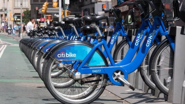
The trip analysis was based on Citi Bike’s public system data, which provides the raw ride records needed to study demand patterns, station activity, and route behaviour.
I treated this Citi Bike case study as a stakeholder-style analytics engagement rather than a hired client project. The brief I gave myself was the brief a real mobility operator would write: we have demand imbalances, we need to know where and when, and we need recommendations a non-data person can act on next week. The output is a multi-page dashboard with weather analysis, hourly demand, top stations, an interactive route map, and a recommendations page, built to support decisions, not to look pretty in a meeting.
This Citi Bike case study walks through how raw trip data, weather data, and station-level analysis can be turned into a practical dashboard for mobility decision-making. If you’ve ever wondered what operational visibility looks like when it’s built deliberately for a transport business, this is the longest answer I can give.
What the Citi Bike Case Study Was Actually Trying to Solve
The goal of this Citi Bike case study was operational, not purely analytical: understand where demand pressure builds, when it happens, and how a bike-share operator could respond. A bike-share operator has one fundamental supply-and-demand problem: bikes need to be available where and when riders want them. Everything else, revenue, customer satisfaction, expansion strategy, flows downstream of that. So the Citi Bike case study was built around four questions a real operations team would need answered:
Where is demand highest, and at which specific stations? When during the day does demand spike, and how predictable are those spikes? How much does weather actually move demand, and is the effect strong enough to plan around? Which station-to-station routes carry the most repeated trips, and what does that imply for rebalancing or expansion?
These are not abstract questions. They map directly to decisions about where to send rebalancing trucks, when to staff up, which stations to expand, and how to plan annual operating budgets. A dashboard that answers those questions is useful. A dashboard that doesn’t is wallpaper.
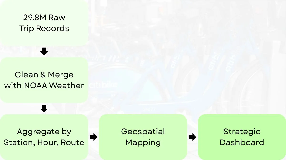
From 29 Million Trip Records to a Decision Tool
The raw dataset Citi Bike publishes is a series of monthly CSV files. After joining the 2022 files, the combined dataset contained 29,838,806 rows. That number matters because it tells you immediately what kind of project this is. You cannot push 30 million rows directly into a dashboard and expect it to load, let alone filter and chart in real time.
Most of the actual work in the Citi Bike case study happened before any chart was drawn. The cleaning steps were specific and consequential. 69,835 rows had missing end_station_name values and had to be excluded from any station-to-station route analysis, they were unusable for the route map but still countable as trips. Removing them brought the dataset to 29,768,282 rows.
Then trip duration. When I recalculated duration from the start and end timestamps, the distribution was nonsensical at the extremes. Some trips registered negative durations (data entry errors or system glitches). The maximum raw duration was over 404,000 minutes, clearly not a real ride. I removed negative durations and trips longer than 200 minutes, which dropped another 60,472 rows and left 29,707,810 cleaned records for the main analytical work.
This cleaning step is the part of the Citi Bike case study that most dashboard write-ups would skip past. It shouldn’t be skipped, because the entire credibility of the dashboard rests on it. If your recommendations are built on a dataset that still contains a 404,000-minute trip, your recommendations are not trustworthy. The dashboard wasn’t the hard part; preparing the data so the dashboard could actually answer the business question was the hard part.
The full CSV to dashboard workflow, from raw CSV files through cleaning, joining and modelling, is broken down step by step in this workflow tutorial.
The NOAA weather merge added another layer. I pulled daily weather data for New York LaGuardia Airport via the NOAA API, then merged it with daily trip totals by date. One technical detail worth flagging: NOAA stores temperature values in tenths of degrees Celsius, not degrees Celsius. If you forget that conversion, which is easy to do, your entire weather analysis looks ten times smaller than it should. Small detail, huge analytical consequence.
The full practical guide to weather data integration with operational records covers that conversion step and a few other traps.
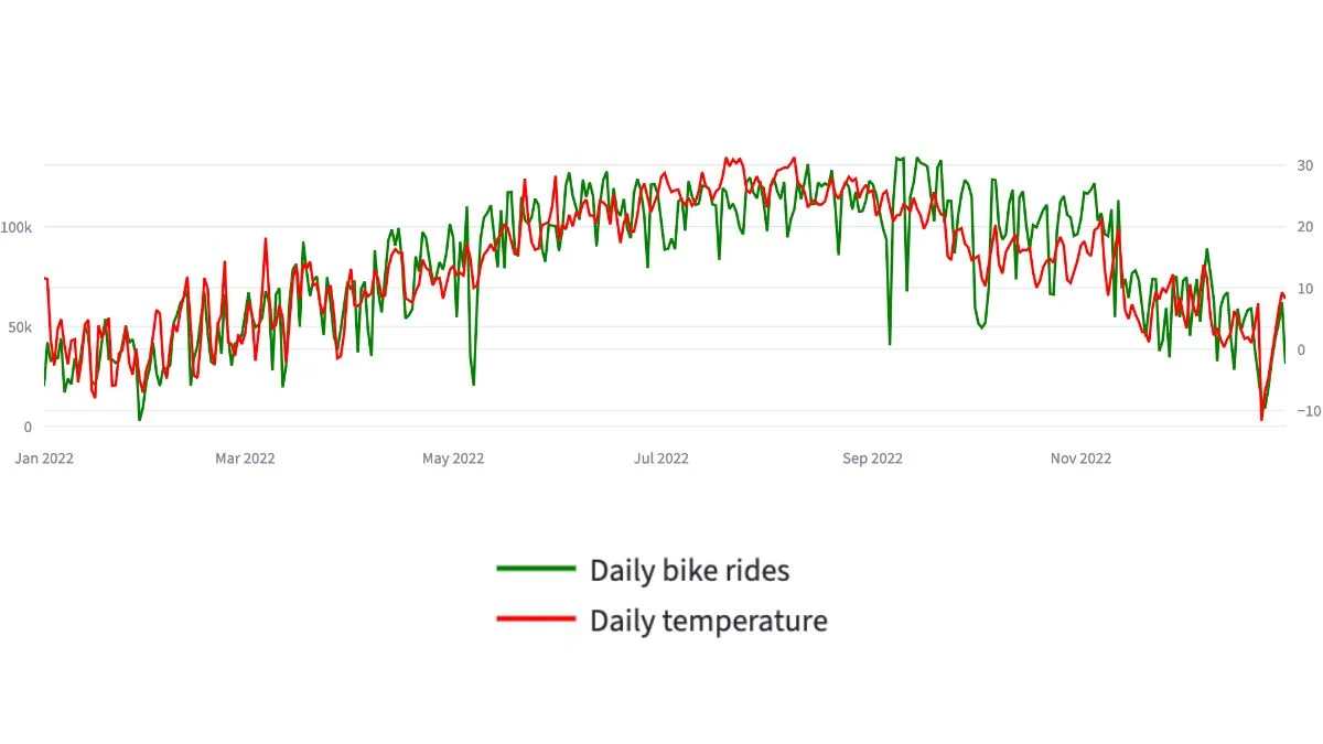
Why Temperature Was the Strongest Demand Signal
The single strongest finding from the Citi Bike case study was the relationship between temperature and rider demand. Daily trip totals and average daily temperature correlated at approximately 0.85 across the full year. That is a strong enough correlation that weather has to be treated as a planning variable, not a background curiosity.
For operators who want to understand how that weather layer is added in practice, this guide to weather data integration for operators breaks the process down in plain English.
The seasonal pattern in this Citi Bike case study was unambiguous. August was the peak month with 3,565,961 trips, followed by September (3,404,153), July (3,388,479), and June (3,337,836). January was the lowest at 1,014,916 trips, roughly 3.5 times less than August. February (1,195,117) and December (1,587,127) rounded out the winter slump.
The contrast between extreme days made the seasonality issue concrete. The busiest single day was 14 September 2022 with 134,851 trips and an average temperature of 22.9°C. The quietest day was 29 January 2022 with 2,809 trips and an average temperature of -4.8°C. That’s a 48-fold difference in daily demand between the warmest and coldest days. A fleet, staffing, and rebalancing plan that doesn’t account for that swing is not a plan, it’s a static deployment that happens to work in spring and autumn and fails in both directions in between.
This is the kind of finding that justifies its own article. I’ve written separately about how the relationship between weather and demand is stronger than most operators realise, because the same pattern shows up in retail, hospitality, and any outdoor-dependent service business. But in transport and specifically in a bike-share network, weather isn’t just a variable. It’s structurally the largest determinant of demand.
The seasonal swing this implies is large enough that it deserves a planning framework of its own, I’ve written separately about how transport seasonality reshapes annual operating rhythm.
The Hourly Pattern Nobody Was Looking At
In this Citi Bike case study, daily totals told one story, but hourly demand revealed the operational pressure points. Hourly aggregation tells you a different one, and the hourly view was where the operational recommendations got sharp.
Across the full year, trip volume by hour followed a clear commuter pattern. Demand was lowest overnight, started climbing from around 06:00, and peaked sharply in the late afternoon and early evening. The busiest single hour across the whole year was 17:00 with 2,686,408 trips. Then 18:00 with 2,557,115. Then 16:00 with 2,278,095. The lowest-demand hour was 04:00, at 93,693 trips, roughly 29 times less than the 17:00 peak.
That single ranking changes how you think about rebalancing. If most of your bike redistribution is happening at convenient times for the operations team mid-morning, early afternoon, lunchtime, you’re rebalancing during the calmest part of the day. The pressure window is 16:00–18:00, and it builds gradually from 06:00. The actionable version of that finding is: rebalancing crews should be deployed heaviest in the late afternoon, not the middle of the day. That’s a specific operational recommendation that fell out of one chart.
For a transport operator, time of day matters as much as location. The dashboard surfaces both, but the hourly view is the one operators tend to undervalue until they see it laid out properly.
The reasoning behind treating the hourly view as its own operational layer is explained in more detail in this article on hourly demand patterns in transport.
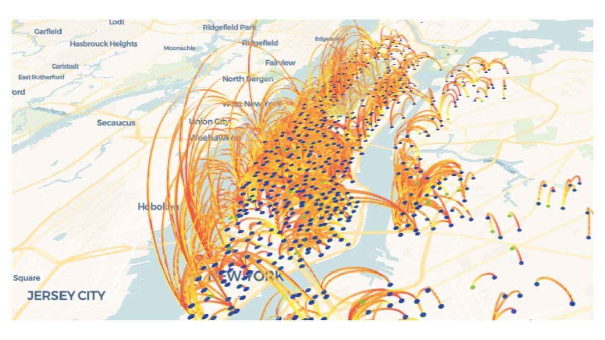
What the Route Map Showed (And What It Did Not)
The geospatial layer was the most visually impressive part of the Citi Bike case study and the easiest to get wrong. The first version of the route map showed every station-to-station pair in the dataset. The visual was striking, a dense web of lines across Manhattan, Brooklyn, and parts of Queens, but analytically useless. There was too much noise to see anything.
The fix was filtering: show only station pairs with at least 750 total trips across the year. That filter reduced the map to 2,925 high-volume station pairs, which is still a lot, but it concentrated on routes that actually mattered. Single one-off trips disappeared. Recurring corridors became visible. Some of the most important operational insights came from filtering noise out of the map, not from adding more visual complexity.
The broader case for using geospatial analysis over spreadsheets in transport operations is worth its own article, the short version is that spreadsheets can’t show you a corridor.
The filtered map revealed something I didn’t expect: many of the highest-volume station pairs were trips that started and ended at the same station. Central Park S & 6 Ave → Central Park S & 6 Ave appeared 11,999 times. 7 Ave & Central Park South → 7 Ave & Central Park South: 8,516 times. Roosevelt Island Tramway → Roosevelt Island Tramway: 8,151 times.
These are not commuter trips. They’re recreational loops, tourists, casual riders, joggers who switched to a bike halfway through. That changes the operational picture significantly. Stations with high same station loop volume need a different rebalancing strategy than commuter stations, because the bike returns to the same dock instead of accumulating downstream. The map also confirmed dense activity along Manhattan’s north-south corridors and waterfront-connected routes, suggesting that station expansion should follow demonstrated movement patterns rather than even geographic spacing.
The Station Level View That Drove the Final Recommendations
Aggregating trips by starting station revealed how concentrated demand really is. The busiest starting station was W 21 St & 6 Ave with 128,642 trips, followed by West St & Chambers St (122,742) and Broadway & W 58 St (113,770). The top 20 stations alone accounted for 1,937,005 trips, about 6.5% of all rides starting from a tiny fraction of the network.
That concentration is operationally significant. A small number of stations carry a disproportionate share of demand, which means rebalancing priority, maintenance scheduling, and bike availability monitoring should be heavily weighted toward those stations. A flat operational policy, equal attention to every station, would systematically under-serve the busiest 20 and over-serve the quietest hundreds.
The final recommendations page in the Citi Bike case study dashboard pulled all of this together into three actions: scale fleet availability seasonally (with roughly a 30–40% reduction between November and April while protecting top-demand stations), concentrate rebalancing around the 06:00–09:00 and 16:00–18:00 windows with heaviest weight on 17:00–18:00, and use station-pair volume rather than geographic spacing to guide expansion. These are the kind of recommendations a monthly sales report doesn’t give you because it tells you the number but not the reason, they only come from looking at the data across multiple dimensions at once.
The recurring pattern, high-demand stations running dry at predictable hours, is a textbook version of the fleet allocation problem most transport operators face.
What This Project Actually Demonstrates
The Citi Bike case study is on my portfolio because it shows the full arc: raw public data, real cleaning at scale, external data enrichment via API, geospatial analysis, multi-page interactive dashboard, and recommendations written for a business audience rather than a technical one. You can see the live Streamlit dashboard here, the GitHub repository here, and the full project presentation page here.
But the lesson underneath this Citi Bike case study is the part worth keeping. A dashboard isn’t valuable because it’s interactive or because it has pretty charts. It’s valuable because the underlying analysis answers operational questions in a way the operator can act on. Every chart in the Citi Bike case study dashboard exists because it changes a decision: where to send a rebalancing truck, when to staff up, which station to expand. Charts that don’t change decisions get cut.
If you’re operating a transport, logistics, or mobility business and looking at the same kind of data gap, daily trip records, route data, demand variability, weather sensitivity, fleet allocation pressure, the custom dashboard service is where you’d start. And if a custom dashboard isn’t quite what you need, maybe you need data cleaning, ad-hoc analysis, or ongoing reporting support, those are other data services I offer too.
The full Citi Bike case study took several iterations to get right. The first version of the data cleaning had to be redone. The first version of the map was too cluttered to read. The first version of the hourly analysis missed the recreational loop pattern. None of that is unusual, large operational datasets rarely give up their insights on the first pass. The point isn’t that the analysis was clean from the start. The point is that the iterations were grounded in real business questions, and the final dashboard answered those questions in a form an operator could use without needing to understand the analysis underneath.
I build custom operational dashboards for businesses with hidden demand patterns, multi-location retail, transport and logistics, booking-based services, e-commerce, and hospitality. The work starts with the decisions you need to make, not the charts.
See how the dashboard service works → or explore other data services if you’re not sure what you need.
Pingback: How Every Multi-Location Business Hides Its Biggest Wins
Pingback: Geospatial Analysis: Smarter Operations, Better Results
Pingback: Weather and Demand: Why Reports Miss the Biggest Variable
Pingback: Powerful Transport Seasonality Planning for Mobility Ops
Pingback: Weather Data Integration: A Smart Practical Guide
Pingback: The Fleet Allocation Problem: How Smart Data Wins
Pingback: The Hidden Cost of Poor Operational Visibility in Business
Pingback: Hourly Demand Patterns: The Critical Hours Operators Miss
Pingback: Lagging vs Leading Indicators: The Critical Operations Gap
Pingback: Essential CSV to Dashboard Workflow: A Smart Tutorial
Pingback: Weather Data Integration: The Best Way to Boost Efficiency
Pingback: Weather Data Integration in Australia: Efficient Hospitality
Pingback: Hotel Forecasting Weather Data: 5 Smart Signs