
If you run a multi location business, you already know the trap… the monthly report says revenue is up, the team says everything’s fine, and then one Tuesday you find out store three has been quietly losing 8% week-over-week for two months and nobody flagged it.
A multi location business fails at the seams. The seams are the gaps between locations, between channels, between what the average says and what the individual unit is doing. A dashboard for a multi location business isn’t a vanity project, it’s the only practical way to keep eyes on every unit without flying around the country or living in spreadsheets.
This article is about the five views I build into almost every multi location business dashboard I work on. If you’re running two locations or twenty, these are the views you should be able to open on a Monday morning and understand in under five minutes. If you can’t, you don’t have visibility, you have hope.
For the broader concept these views sit inside, see what operational visibility means for your business.
Why averages are the enemy of a multi location business
Before the five views, one principle worth stating clearly: averages lie. They’re the single biggest source of bad decisions in a multi location business.
When your business has six locations and your monthly report tells you “average revenue per location is $48,000,” it’s giving you a number that probably doesn’t describe any actual location in your portfolio. One store is doing $78,000. Two are doing $52,000. Three are doing $32,000. The average is a fiction the spreadsheet invented.
Every view below is designed to break that fiction apart and show you what’s actually happening at each location. If you take one thing from this article, it’s that the moment you stop trusting averages, you start seeing your business clearly.
The deeper problem with the network average isn’t bad math, it’s that averages structurally destroy the variance multi-location operations need to see in order to act.

View 1: Location performance grid, every unit, side by side
This is the foundation. A simple grid that lists every location and shows the metrics that matter most for your business, revenue, transactions, average ticket size, customer count, whatever’s relevant for the current week, the previous week, and the same week last year.
Three columns of comparison. That’s it.
No multi location business has truly clear visibility without this view as the foundation. The reason this view matters is that it forces you to look at every location at the same time, on the same scale. You can’t hide an underperformer behind a strong location, because they’re both on the screen. You can’t dismiss a number as “probably a blip” because last year’s same-week number is right next to it.
What you’re looking for: locations that are diverging from the group. If five stores are doing 4–6% week-over-week and one is doing -3%, that’s the signal. You don’t need fancy statistics to see it. You need the data laid out so the divergence is visible at a glance.
The hardest part isn’t the visualisation. It’s getting the data from every location into the same format, on the same cadence, with the same definitions of what counts as “revenue.” Most multi location business owners have at least one location running on a different system, or one manager who reports differently. That’s the actual work of building this view, and it’s the part most DIY attempts get wrong.
View 1 is the entry point, but the deeper question is which comparison framework you’re using underneath it. A five-layer framework for multi-store retail analytics, baseline, peers, trajectory, role, network, is what stops the ranked list from misleading you.
View 2: Day-of-week and hour-of-day demand pattern
This is the view that earns its keep faster than any other. For each location, what does the demand pattern look like across the week and across the day?
If you’re a retail business, this tells you when foot traffic is concentrated and when your staff are standing around. If you’re a service business, this tells you when the booking pressure peaks and when capacity is being wasted. If you’re hospitality, this tells you when the kitchen is overwhelmed and when it could absorb a promotion.
A useful version of this view is a heatmap, days of the week on one axis, hours on the other, with colour showing intensity. You should be able to glance at it and immediately see the hot zones and the dead zones for each location.
What you’ll usually find:
- Demand is far more concentrated than you think. A surprising number of businesses do 60% of their revenue in 20% of their open hours.
- The peak times differ between locations more than you’d expect, even within the same brand and city.
- The dead zones are often staffed exactly the same as the peak zones, which is where labour cost leaks happen.
This view alone has paid for entire dashboard projects in the form of corrected staffing schedules. It’s the highest-leverage thing you can see.
View 3: Seasonality and trend view, what’s normal, what’s not
A multi location business lives and dies by knowing when to staff up, stock up, and lean into demand. Most of them are reactive, they realise it’s the summer rush in the second week of the summer rush, by which point they’re already understaffed.
The seasonality view solves this by overlaying the current period against the same period in previous years, location by location. You should be able to see, for each store, whether it’s running ahead, on, or behind its historical curve for this point in the year.
This is also the view where weather, school calendars, paydays, and local events become visible as demand drivers. For some businesses these external variables explain more of the variance than anything you can control internally. If you’ve never quantified that, you’re making capacity decisions on incomplete information.
I built a strategic dashboard for NYC Citi Bike that used NOAA weather data merged with trip data specifically to show how much of demand was weather-driven versus organic. The answer surprised even me. Most operators underestimate how much of their week-to-week variance is external and how much is internal, and they make staffing decisions assuming it’s the opposite.
The seasonality view is what turns reactive operations into anticipatory operations. It’s the difference between staffing up because last week was busy and staffing up because the next four weeks have historically been your peak.
The weather data came from NOAA’s National Centers for Environmental Information, a public dataset that any operator can merge with their own sales or booking data to quantify how much of their demand is weather-driven.
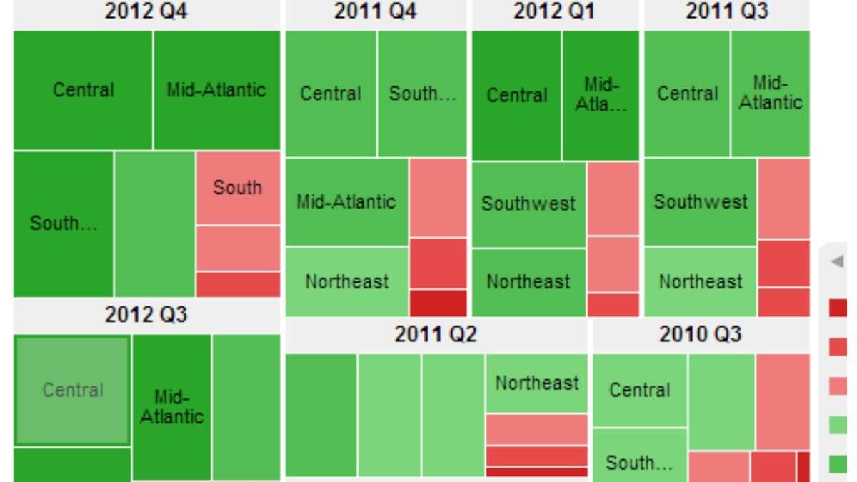
View 4: Location contribution and concentration
This view answers a question almost no multi location business owner can answer cleanly off the top of their head: what percentage of total revenue comes from each location, and how is that concentration changing over time?
Most operators have a rough sense, “store one is our best, store five is the weakest.” But “rough sense” hides things. A flagship that contributed 35% of revenue two years ago and contributes 28% today is in slow decline, even if its absolute numbers look stable. A weak performer that’s grown from 8% to 14% of revenue is quietly becoming important, even if it’s still below average.
A good contribution view shows you both the snapshot (this month’s split) and the trend (how the split has changed quarter over quarter). It tells you which locations are gaining share inside your portfolio and which are losing it, independent of whether overall revenue is up or down.
This is the view that informs investment decisions. Where do you put the next manager hire? Which location gets the renovation budget? Which one is structurally underperforming and needs intervention versus just having a slow month? You can’t make those calls cleanly without seeing concentration over time.
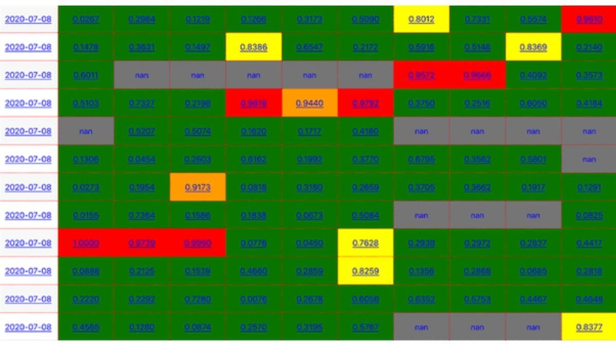
View 5: Anomaly and threshold flagging
The first four views require you to look at them. The fifth view does the looking for you. In a multi location business, this is the view that scales, because no operator can watch every unit at the same time, but a dashboard can.
Anomaly flagging is the simplest version of what the data world overcomplicates as “alerting.” You define thresholds for each location, revenue below X, transactions below Y, average ticket above or below a range, and the dashboard flags anything that crosses the line.
The point isn’t to replace your judgement. It’s to make sure you actually see the thing before it becomes a three-month trend you wish you’d caught earlier. A flag on Monday morning that says “store four is 12% below its rolling four-week average” is worth more than any retrospective report.
Two principles for this view:
Set thresholds per location, not globally. A 10% revenue drop means different things at your flagship versus your smallest store. Generic thresholds generate noise.
Flag deviations from normal, not absolute numbers. “Revenue under $5,000” is a useless flag because some locations are always under $5,000. “Revenue 15% below the trailing 8-week average for this day of week” is a useful flag because it adjusts for what’s normal at that specific location.
This view is harder to build than the others because it requires you to define what “normal” looks like for each unit. But it’s the view that pays back the most in operator attention, it’s the only one that catches problems while you’re not looking.
What this looks like when it’s built well
Five views. Each one pointed at a specific decision. Each one designed around the fact that you run multiple locations and need to see them in comparison, not in summary.
This isn’t a Power BI deployment with 47 KPIs and three tabs of filters. It’s a focused operational tool, the kind of thing you open on Monday morning, read in five minutes, and close knowing what needs your attention that week. Most multi location business owners I work with have everything they need to build this already. The data exists. It’s in the POS exports, the booking system, the staffing logs. It’s just not surfaced in a way they can act on.
If you want to see what it looks like when these views are actually built and pointed at a real operational question, I build custom dashboards for any kind of multi location business, the work involves reviewing your data, agreeing on which decisions matter, and shaping these views (or the right subset of them) around your business. The output isn’t a chart library. It’s a weekly habit that replaces guesswork with visibility.
For a multi location business, that gap is the difference between a portfolio you control and a portfolio that quietly drifts. A dashboard isn’t a decoration. It’s the difference between running your business and your business running you.
Of course, these five views only help if your managers actually open the dashboard and use them in the weekly rhythm. If that part is weak, dashboard adoption is a separate problem worth tackling head-on.
I build custom operational dashboards for businesses with hidden demand patterns, multi-location retail, transport and logistics, booking-based services, e-commerce, and hospitality. The work starts with the decisions you need to make, not the charts.
See how the dashboard service works → or explore other data services if you’re not sure what you need.
Pingback: Why Your Monthly Sales Report Doesn't Tell You What To Do
Pingback: What Operational Visibility Really Means for Your Business
Pingback: Why Averages Destroy Multi-Location Operations