A spreadsheet of trip data and a map of trip data are not the same artefact. They contain the same underlying numbers, but they answer different operational questions, and the spreadsheet answers fewer of them than most operators realise. This sounds obvious when stated plainly. It stops being obvious the moment you look at the actual operational reports most transport businesses run on, which are, almost universally, spreadsheets with no geospatial analysis layer attached.
Geospatial analysis is the practice of looking at operational data with location as a first-class dimension rather than a label in a column. For any transport, logistics, or mobility business, that distinction is the difference between knowing that 11,999 trips happened between two specific station IDs and seeing that a particular corridor of Manhattan carries a dense, recurring loop of bike traffic that loops back to the same start point. The first finding goes in a quarterly report. The second one changes where you send the rebalancing truck on Tuesday afternoon.
This article makes the case for treating geospatial analysis as a core operational tool rather than a nice to have visualisation layer. The argument isn’t aesthetic, maps are not better than spreadsheets because maps look prettier. The argument is structural: there are categories of operational decisions that spreadsheets cannot support, no matter how cleanly they’re formatted, because the data shape doesn’t match the decision shape.
What a Spreadsheet Structurally Cannot Show You
A spreadsheet is, at its best, a sorted list of facts. You can sort it by volume, filter by date, group by station, and total by route. What you cannot do at all is see proximity. Two adjacent stations on a city map are no closer in a spreadsheet than two stations five miles apart. The visual concept of near doesn’t exist in a tabular structure.
This matters because most operational questions in transport are spatial. Which stations are clustered enough that they share rebalancing demand? Which corridors carry repeated traffic? Where are the gaps in coverage? Which two adjacent stations are both running dry at the same time of day? Every one of these questions is a question about how points relate to each other in space, and a spreadsheet flattens space into row order. The data is there, but the relationships aren’t.
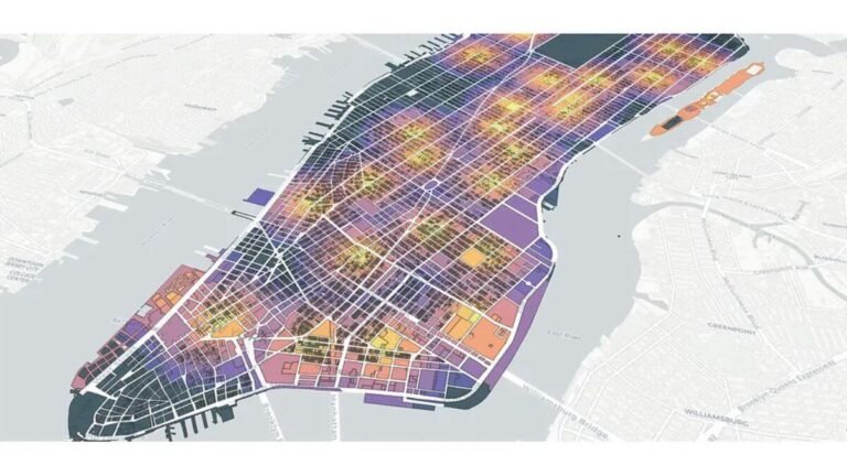
The second thing spreadsheets can’t show is density. You can count trips per station, but you can’t see at a glance which neighbourhood has dense overlapping demand versus which neighbourhood has thin scattered demand. A heatmap built from geospatial analysis shows that distinction immediately. A spreadsheet hides it inside the row count.
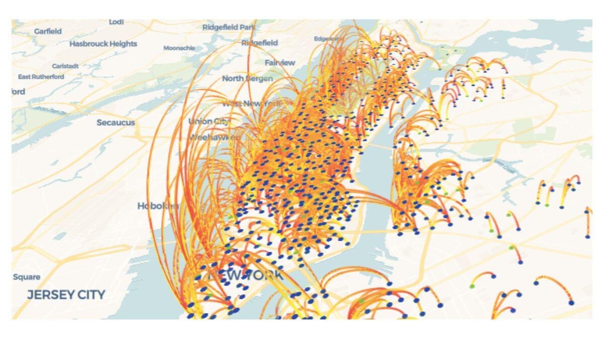
The third is directional flow. Station A → Station B at 8 a.m. is fundamentally different from Station B → Station A at 6 p.m., even though the trip count between the two stations might be identical. In a spreadsheet, you can sort by origin-destination pairs. On a map with directional arrows, you can see the morning commute reverse into the evening commute, and you can plan rebalancing around that reversal rather than around the daily total.
These are not edge cases. They’re the operational core of any business that moves things or people through space, and they’re exactly the questions geospatial analysis is built to answer. Treating them with a spreadsheet is like treating temperature with a list of months, the data is technically present, but the structure can’t support the question.
How Route Concentration Looks on a Map vs in a Table
The most concrete example I’ve worked through is route concentration analysis using the public Citi Bike 2022 dataset. After cleaning, the dataset held just under 30 million trips. Aggregated to station-to-station pairs, the data was hundreds of thousands of rows long.
In a spreadsheet, the top routes are simply the highest-count rows. You can see that Central Park S & 6 Ave → Central Park S & 6 Ave appeared 11,999 times, that 7 Ave & Central Park South → 7 Ave & Central Park South appeared 8,516 times, and that Roosevelt Island Tramway → Roosevelt Island Tramway appeared 8,151 times. Three pieces of information. Three rows in the table. End of story until geospatial analysis enters the picture.
On a map, the same three rows tell a completely different story. All three are same-station loops. They cluster around well-known recreational areas, Central Park, the waterfront, Roosevelt Island. They are visually adjacent to a wider network of commuter routes running north-south through Manhattan. The same-station loops are operationally distinct from the commuter routes because the bike returns to the same dock, which means the inventory effect of those trips is different from a commuter trip that drains one station and fills another.
That distinction is invisible in the spreadsheet. With geospatial analysis layered on top, it’s the first thing you see. The full Citi Bike case study walks through this end to end, the route map filtering, the same station loop discovery, the operational implications, and the whole point of the geospatial layer is that it forced findings that the tabular analysis missed.
The same principle applies to any transport network. Whether the data is bike trips, ride-share trips, delivery routes, or fleet movements, the spatial layer reveals concentration patterns that the tabular layer flattens.
Bike share operators can also learn from NACTO’s research on urban mobility patterns, especially when analysing how riders move through dense city networks.
Decisions Geospatial Analysis Actually Changes
It’s worth being specific about which operational decisions improve when geospatial analysis is in the mix, because the case for maps is sometimes made in vague terms and that’s not useful. Four decision categories shift meaningfully once spatial data is part of the operations stack.
Rebalancing prioritisation. When you can see which stations are spatially clustered and running on the same demand cycle, you can plan rebalancing routes that touch multiple high-demand stations on a single trip rather than dispatching trucks back and forth across the network. Tabular data tells you which stations are busy. Spatial data tells you which busy stations are close enough to handle together.
Expansion planning. Most new station decisions are made on a combination of intuition and even geographic coverage. Geospatial analysis lets you base expansion on demonstrated demand corridors, places where existing stations are routinely full or empty and where the route map shows repeated traffic that current infrastructure can’t absorb. Filling a known corridor is a better expansion bet than placing a new station on a map grid.
Service gap detection. A spreadsheet of trip counts shows you which stations are busy. A map of trip origins overlaid with route corridors shows you where customers are starting trips that don’t fit any standard pattern, possibly because the station they really want doesn’t exist yet, and they’re walking ten minutes to reach the nearest one. Service gaps are a spatial concept, and spatial tools find them faster.
Marketing and partnership decisions. When a transport network has demonstrated dense corridors through specific commercial districts or near specific landmarks, those corridors become legitimate sales material for local partnerships, sponsorships, or advertising placements. None of those conversations work with a spreadsheet. All of them work with a map.
This is why I treat geospatial analysis as part of what real operational visibility looks like for any transport business. It’s not a separate analytical layer. It’s the layer that makes the rest of the data operationally meaningful.

When a Spreadsheet Is Still the Right Tool
To be fair, spreadsheets are still the right tool for plenty of analytical work. Aggregating monthly revenue per station, calculating utilisation rates per vehicle, comparing two periods on a single KPI, these are tabular questions and a spreadsheet handles them well. The argument isn’t that maps replace spreadsheets. It’s that maps are a separate analytical instrument with its own questions, and most transport operations are running half-blind because the map layer is missing.
The honest version of the case is this: spreadsheets are the primary tool, but they’re insufficient on their own for any question that involves spatial proximity, density, flow direction, or corridor identification. Those questions need geospatial analysis sitting alongside the tabular work. Build both, use both, and let the map answer the questions the spreadsheet structurally can’t.
The Practical Argument for Adding Maps to Your Operations Stack
For a transport, logistics, or mobility operator who’s currently running on spreadsheets, the cost of adding geospatial analysis isn’t as high as it used to be. The Citi Bike route map I built was done with Kepler.gl, which is open-source and free. Folium and Plotly’s mapping libraries both run inside standard Python workflows. The bottleneck is no longer the tooling, it’s the discipline of treating spatial data as a first-class operational input rather than an occasional reporting flourish.
The same multi-dimensional thinking applies to other variables. Weather and demand work the same way, most operators look at one or the other but not both together, and the cross-cut is where the actionable findings live. Spatial data is similar. Looking at trip data without the map is like looking at sales data without the calendar: the information is technically present, but the analytical structure can’t support the question.
If a transport business is at the point where the spreadsheet has stopped being sufficient, too many stations, too many routes, too many demand patterns to hold in a flat table, that’s the point where a custom operational dashboard built for transport starts paying for itself. And if a custom dashboard isn’t quite what you need, maybe you need data cleaning, ad-hoc analysis, or ongoing reporting support, those are other data services I offer too.
The point isn’t to replace the spreadsheet. It’s to stop pretending the spreadsheet alone is enough for a fundamentally spatial business. Geospatial data is one of the strongest inputs into solving the fleet allocation problem before it becomes a customer complaint.
I build custom operational dashboards for businesses with hidden demand patterns, multi-location retail, transport and logistics, booking-based services, e-commerce, and hospitality. The work starts with the decisions you need to make, not the charts.
See how the dashboard service works → or explore other data services if you’re not sure what you need.
Pingback: The Hidden Cost of Poor Operational Visibility in Business
Pingback: The Fleet Allocation Problem: How Smart Data Wins
Pingback: Weather and Demand: Why Reports Miss the Biggest Variable
Pingback: Citi Bike Case Study: A Powerful Mobility Dashboard Build
Pingback: Powerful Transport Seasonality Planning for Mobility Ops