
It’s a Friday at 5:47pm in Manhattan. A rider walks up to a bike dock at 6 Ave and W 33 St. The dock is empty. She waits a minute, checks her phone, then orders a rideshare instead. That station has been empty at this exact time, on this exact day of the week, for the last six weeks.
This is the fleet allocation problem. It’s not glamorous. It’s not the kind of thing that lands in a board pack. But it’s the single most expensive operational issue in transport, logistics and mobility, and the most frustrating part is that the data almost always shows the shortage building up days before a customer ever feels it.
The fleet allocation problem is when the vehicles, bikes, drivers, or units you operate are not in the right place at the right time. The total count might be fine. The fleet on the spreadsheet looks healthy. But where it matters, that station, that suburb, that 30-minute window, there is nothing available. The customer leaves. The trip never happens. And nobody on the operations side finds out until someone complains.
Most operators try to solve this by adding more units. That rarely works. The real solution is better visibility, not more inventory. Optimising fleet allocation efficiency is one of the most complex operational challenges for transportation businesses, so learning how to effectively improve it will solve many issues.
What the fleet allocation problem actually looks like
Let me give you a specific picture. A mid-sized last-mile delivery operator has 45 vans across a metro area. On paper, that’s plenty. Their monthly report shows 92% of orders delivered on time. The CEO is happy.
But the operations manager knows something the report doesn’t. Every Tuesday and Wednesday between 2pm and 5pm, three specific postcodes go short. Drivers in those zones stack up backlogs. The 8% of late deliveries aren’t spread evenly, they cluster. And the customers in those postcodes are starting to churn.
The monthly report doesn’t show this. The dashboard the finance team built doesn’t show this. It would only show up if someone built a view that breaks deliveries down by postcode, day of week, and hour of day at the same time. Most operators don’t have that view, which is exactly why the fleet allocation problem stays invisible until customers start churning.
That’s the fleet allocation problem in one sentence: the total looks fine, but the distribution is broken. And the fleet allocation problem is almost always a distribution problem first, a volume problem second.
Why most operators spot the fleet allocation problem too late
Three reasons. They’re all fixable.
The first reason is averaging. Almost every operational report rolls data up to weekly or monthly totals. Averages hide the spikes. A van that’s idle on Monday and overwhelmed on Wednesday looks “average” across the week. The shortage gets washed out.
The second reason is the wrong unit of measurement. Most operators measure capacity in vehicles or units, not in slots of time. A 45-van fleet running 8 hours a day isn’t 45 vans of capacity, it’s 360 van-hours, distributed across specific routes and time windows. When you measure capacity the way customers experience it (a specific place, a specific time), shortages become visible.
The third reason is that demand can shift overnight when the weather changes. A sudden rainy Wednesday in summer can drop bike share demand by 40%. A heatwave can spike rideshare demand by 25%. If your fleet planning doesn’t react to these signals within hours, you’re chasing yesterday’s pattern.
The fix isn’t more drivers, more bikes, or more vans. The fix is being able to see distribution before the customer does.

The four signals that catch shortages early
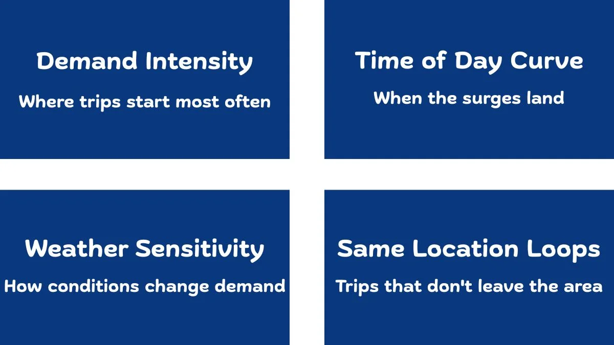
When I work with transport operators, four signals together get me most of the way to solving the fleet allocation problem. None of them are exotic. All of them are usually already in the data.
Signal one: demand intensity by location. Where does the trip actually start? Not “in the metro area”, at which specific station, postcode, or zone. In transport data, demand is almost never evenly distributed. The top 20 starting points usually account for a disproportionate share of the volume. You need to know which ones, in your network, are the pressure points.
Signal two: the time-of-day curve. Demand has a shape. In most urban transport networks, there’s a quiet overnight stretch, a steep climb from around 6am, and a peak in the late afternoon. The shape of that curve is different for every business and every location. If you don’t know your shape, you can’t allocate against it.
Signal three: weather sensitivity. This one surprises most operators. Demand in transport and mobility is far more weather-driven than most people realise. On a recent project I looked at, daily demand and average temperature had a correlation of about 0.85 across the whole year. That’s strong. Strong enough that any allocation plan that doesn’t include weather is leaving 20–40% of accuracy on the table.
Signal four: same-location loops. This is the one nobody looks at, and it can completely change how you think about allocation. Some of the highest-volume trips in a transport network start and end at the same place. They’re not commute trips. They’re recreational, tourist, or short-loop usage. These stations need a different operational plan, they often need more bikes or units left at the station, not redistributed away from it.
Those four signals together, location, time-of-day, weather, and same-location loops, are enough to spot 80% of the fleet allocation problem in most transport operations.
What the fleet allocation problem looked like in the Citi Bike data
When I built the worked example from the Citi Bike project, the fleet allocation problem was the operational story underneath almost every interesting finding. The 2022 dataset had nearly 30 million trips after cleaning. Once I aggregated them properly, the allocation issues showed up clearly.
The busiest starting station, W 21 St & 6 Ave, handled around 128,642 trips that year. The second and third busiest stations each handled more than 113,000. The top 20 stations together accounted for nearly 2 million trips. If you ran that network on the assumption that demand was spread evenly across stations, you’d run dry at the top 20 every single peak hour.
The hourly pattern was just as concentrated. The single busiest hour of the year was 5pm, with over 2.6 million trips. The window from 4pm to 6pm was the daily pressure point. Any rebalancing crew working a 9-to-5 shift was, by definition, missing the moment the network needed them most.
Fleet allocation decisions get sharper when you can see the hour-by-hour shape of demand. I’ve written more on hourly demand patterns and the operational decisions they sharpen.
And the temperature relationship was strong enough that winter demand was less than a third of summer demand. A fleet plan built for July was wildly oversized for January, and a fleet plan built for January would have starved every popular station in August.
The point isn’t the specific numbers. The point is that the allocation answers were already in the data, they just weren’t visible in any monthly or weekly summary. You had to slice the same data by station, by hour, and by weather to see them.
The cost of getting this wrong
It’s tempting to treat fleet allocation as a quality-of-service issue rather than a revenue issue. That’s a mistake.
Every empty dock, missing van, or unavailable unit at the moment of demand is a lost trip. In bike share that’s a $3 to $5 loss per incident. In rideshare it’s $15 to $30. In last-mile delivery it’s a missed delivery window, which often triggers a refund, a redelivery, and sometimes a churned customer worth several hundred dollars.
A reasonable estimate: a transport operator running at 5% of trips lost to allocation issues, on a $5M revenue base, is leaving $250,000 on the table every year. And that’s just direct revenue. It doesn’t include the churn, the negative reviews, or the operational cost of customer service teams handling complaints that should never have been generated.
If a custom dashboard isn’t quite what you’re after, maybe you need data cleaned, an ad-hoc analysis run, or ongoing reporting support, those are services I offer too.

What this looks like in a dashboard
The dashboard view for the fleet allocation problem doesn’t need to be complicated. In most cases it’s three things on one page:
A map showing demand concentration at the station, zone, or postcode level, using actual trip starts rather than evenly-spaced grid cells. This is where mapping where trips actually happen earns its keep.
A heatmap of demand by hour and day of week. The shape of this chart should be instantly readable, you should be able to glance at it and say “Wednesday at 4pm is the pressure point.”
A weather overlay on daily demand. Not a separate weather report. The weather variable laid directly on top of the demand chart, so you can see how the demand curve actually reacts to temperature and precipitation.
A dashboard that gives you these three views is a dashboard that lets you allocate fleet against the way customers actually use the network, not against the way the spreadsheet says they should. That’s the kind of decision support tool a custom operational dashboard built around fleet decisions is meant to be.
How to start, without rebuilding everything
You don’t need a perfect system to make progress on the allocation problem. You need three weeks of clean trip-level data, a way to tag location and time, and weather data merged in by date.
Here’s a starting checklist for any transport or mobility operator who suspects the fleet allocation problem is hitting their network:
Pull at least three months of trip data at the most granular level you have, individual trip records, not daily summaries. Aggregate by starting location and by hour-of-day. Pull average daily weather for the same period from a public source and merge it by date. Plot demand against temperature on the same chart and look at the shape. Identify the top 20 starting locations and the three busiest hours. Compare those locations’ availability data against demand at those hours.
If you can do those six things, you’ll find your top 3 to 5 allocation pressure points within an afternoon. Fixing them is a longer conversation, that’s the rebalancing, staffing, and scheduling work, but seeing them is the first step, and most operators never take it.
The customers don’t tell you about the trips that never happened. The data does, if you ask it the right way, and that’s how the fleet allocation problem gets solved before it costs you the next quarter.
I build custom operational dashboards for businesses with hidden demand patterns, multi-location retail, transport and logistics, booking-based services, e-commerce, and hospitality. The work starts with the decisions you need to make, not the charts.
See how the dashboard service works → or explore other data services if you’re not sure what you need.
Pingback: Powerful Transport Seasonality Planning for Mobility Ops
Pingback: Geospatial Analysis: Smarter Operations, Better Results