It’s the first Monday of the month. The operations manager opens last month’s report. Revenue is down 6%. Five locations underperformed. Two products sold worse than expected. The team spends the next ninety minutes arguing about what went wrong in October, a month that is already over.
This is the cost of running an operations function on lagging indicators alone. By the time the numbers land, the decisions that could have changed them have already been made.
The lagging vs leading indicators distinction isn’t a theoretical one. It’s the difference between a dashboard that tells you what happened and a dashboard that tells you what to fix this week. Most operations teams have plenty of the first kind. Very few have the second.
This article is about why that gap exists, what each type of indicator is actually for, and how to build a dashboard that uses both without confusing them.
What lagging vs leading indicators actually mean
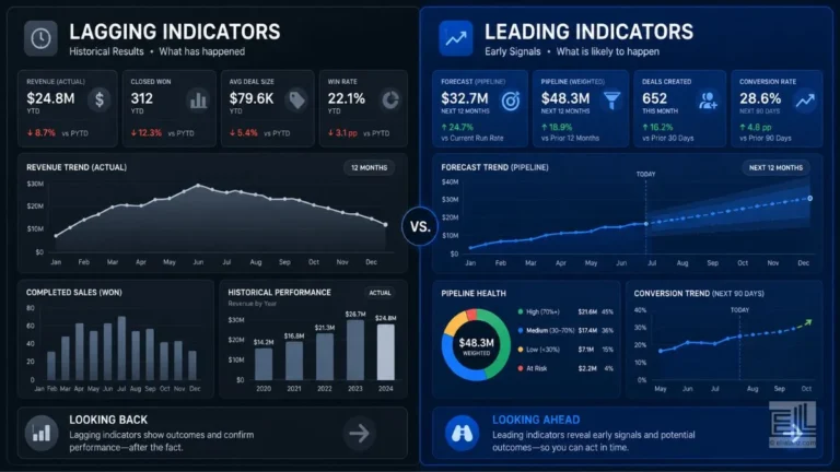
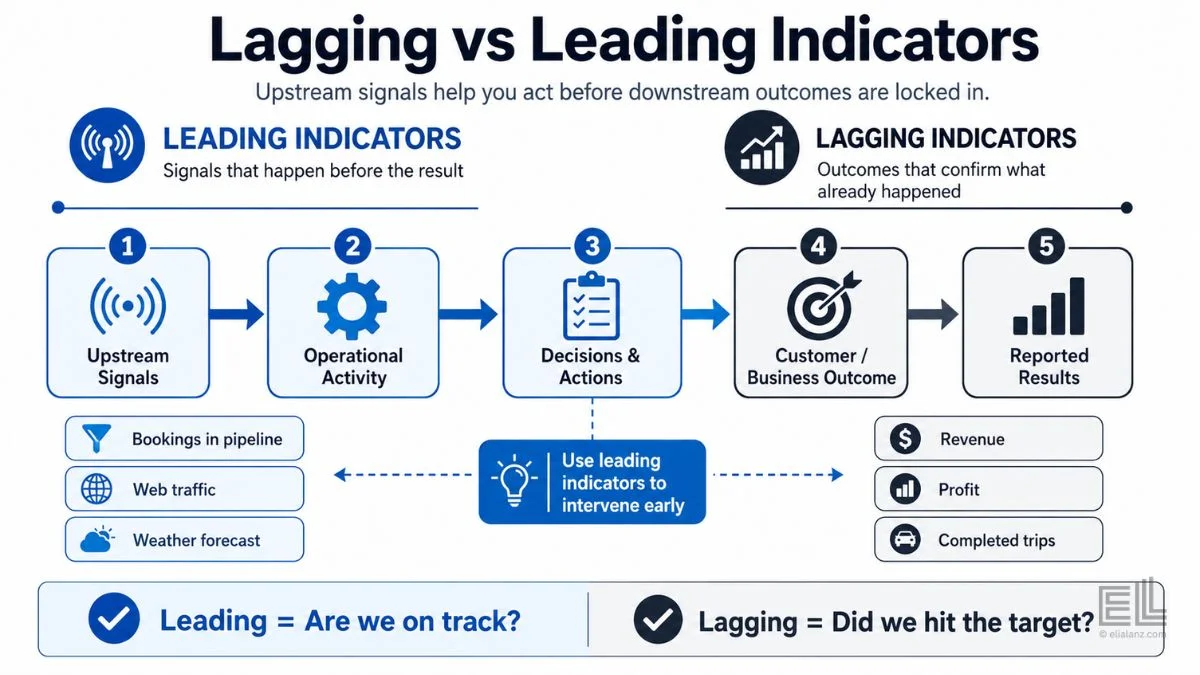
A lagging indicator is a measurement of an outcome that has already happened. Revenue, profit, customer count, completed trips, and finished bookings are all lagging indicators. They confirm what the business produced.
A leading indicator is a measurement of something that precedes an outcome. Bookings in the pipeline, web traffic, repeat-customer engagement, weather forecasts, and station-level demand pressure all happen before the lagging number changes.
The cleanest way to think about lagging vs leading indicators is this. A lagging indicator answers the question “did we hit our target?” A leading indicator answers the question “are we on track to hit it?”
Both matter. The mistake is using lagging numbers to make decisions that needed to be made before the lagging numbers existed.
Why most operations dashboards over-rely on lagging indicators
Lagging indicators are easier to measure. They’re tied to systems that already exist: the POS, the booking platform, the accounting software. They get reported because they’re the numbers a CFO or investor wants to see.
Leading indicators are harder. The lagging vs leading indicators decision requires the operator to identify which upstream metric actually predicts the outcome, and that judgement needs real operational knowledge. A retail manager has to know that staffing-to-foot-traffic ratio on Friday evenings predicts Saturday’s revenue more reliably than last Saturday’s revenue does. A logistics operator has to know that route utilisation in the morning predicts whether the afternoon will have stockout risk.
That kind of knowledge doesn’t show up automatically in software. It comes from someone who has watched the business long enough to recognise the patterns. Which is why most lagging vs leading indicators conversations stall at the same point: everyone agrees leading indicators are better, and no one can agree which leading indicators to track.
The pattern that gives this away
You can spot a dashboard that relies too heavily on lagging indicators with one question. Ask the manager: “What decision did you make this week because of the dashboard?”
If the answer is “I saw revenue was down so I asked the team why,” the dashboard is lagging. The decision is reactive. The data informed an investigation, not an intervention.
If the answer is “I saw morning traffic was 18% below forecast, so I pulled the afternoon staffing back before payroll closed,” the dashboard is leading. The decision is proactive. The data prevented the lagging number from going wrong in the first place.
This is the test. Lagging vs leading indicators isn’t an academic distinction. It’s a working test of whether your operational data is helping you make decisions or just helping you explain them after the fact.
What leading indicators look like across industries
The right mix of lagging and leading indicators depends on the business. A few examples that I see hold up across operator types.
For multi-location retail. Day-of-week foot traffic compared to the same day last week is a leading indicator for the coming weekend’s revenue. So is staffing-to-traffic ratio. So is inventory turnover by SKU at the location level, because it predicts which products will be out of stock during the next peak window.
For transport and logistics. Hourly demand patterns at the station or route level predict where shortages will happen later in the day. Weather forecasts predict the next week’s demand curve. Driver utilisation rates in the first half of a shift predict whether the second half will have service gaps. Operator survey work from the Bureau of Transportation Statistics also supports the value of tracking utilisation earlier in the shift, rather than waiting for end-of-day reports.
For booking-based businesses. Booking lead time (how far in advance reservations come in) is a leading indicator for occupancy. No-show rate trends predict revenue leakage. Channel mix shifts predict margin compression before it shows in the P&L.
For e-commerce. Cart add rate predicts revenue. Returns rate trends by product category predict inventory write downs. Subscription churn signals predict next quarter’s recurring revenue.
The common thread is this: in every case, the leading indicator measures something earlier in the operational chain than the financial outcome. That’s what makes it actionable. You can still do something about it.
Where the Citi Bike data made this concrete
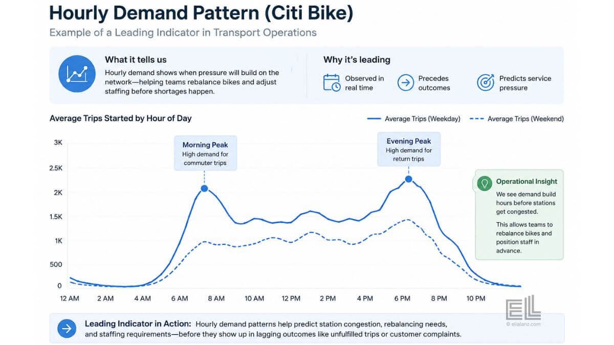
When I built the Citi Bike strategic dashboard, the most useful single insight wasn’t the year-end trip total. It was the hour-of-day pattern.
The dashboard showed that demand pressure peaked at 17:00 with 2,686,408 trips across the year, with the 16:00–18:00 window absorbing the heaviest rebalancing load. The monthly trip totals (a lagging indicator) confirmed that August was the busiest month with 3,565,961 trips. But the monthly number told the operator nothing about when during August to intervene.
The hourly demand curve was the leading indicator. The lagging vs leading indicators split inside the same dataset told the operations team where rebalancing needed to happen before riders started showing up at empty docks. The lagging number, total trips, was useful for board level reporting. The leading number, hourly pressure, was useful for the decisions that actually changed the rider experience. The Citi Bike case study breaks the year down hour by hour and shows how those patterns translate into specific operational moves.
That distinction is the entire point. The same dataset produced both kinds of indicator. The difference was in how the dashboard surfaced them.
The three mistakes operators make with lagging vs leading indicators
The first mistake is treating leading indicators as if they’re forecasts. They’re not. A leading indicator says “based on what’s happening upstream, the lagging outcome is trending in a direction.” It does not predict the future; it tells you what the early evidence currently suggests. The operator still has to decide whether the signal is strong enough to act on.
The second mistake in handling lagging vs leading indicators is tracking too many leading metrics at once. Once you start identifying them, it’s tempting to monitor everything that could predict an outcome. But a dashboard with twenty leading indicators is worse than a dashboard with three, because nobody knows which one to act on first. The discipline is to pick the two or three leading indicators that have the strongest historical relationship to the lagging outcome you care about, and ignore the rest.
The third mistake is mismatched timeframes. A leading indicator that updates monthly is almost useless for an operational decision that needs to be made weekly. The cadence of the leading indicator has to be faster than the decision cycle it’s meant to support. If you’re staffing weekly, your leading indicators need to refresh daily. If you’re rebalancing inventory hourly, your leading indicators need to refresh hourly.
This is where most dashboards go wrong. They have leading indicator data, but it’s locked into a monthly reporting cycle that’s slower than the decisions that depend on it.
How to redesign a dashboard around both
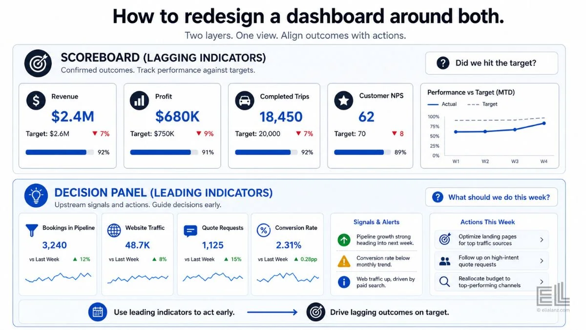
A working operations dashboard treats lagging vs leading indicators as two different layers, not two competing options.
The lagging layer is the scoreboard. Revenue, completed trips, finished bookings, profit. This is what the dashboard shows to confirm that the strategy is working. It updates monthly or quarterly, and it’s the answer to “are we hitting our targets?”
The leading layer is the decision panel. The two or three upstream metrics that have the strongest predictive relationship with the lagging outcomes. This is what the dashboard shows to enable interventions. It updates daily or hourly, and it’s the answer to “what should we do this week?”
Most operators don’t need a new dashboard. They need to separate the lagging vs leading indicators into two distinct layers inside the dashboard they already have. The scoreboard goes on one page. The decision panel goes on another. The team learns to use each layer for a different purpose, and the dashboard stops forcing every metric to compete for attention.
If you’re starting from raw CSV files rather than an existing dashboard, this CSV to dashboard workflow tutorial covers the build process step by step.
If you want to dig into how this kind of redesign works in practice across different operator types, the operational visibility piece walks through the broader principle, and the KPI trap article covers what happens when the indicators themselves are wrong.
If a custom dashboard is not the right fit for your business yet, you may need data cleaned first, or an ad hoc analysis before any dashboard makes sense: Those are services I offer too.
The shift this actually requires
The hardest part of moving from lagging to leading indicators isn’t the analytics. It’s the management habit.
Operators who run on lagging indicators run on explanation. Every month, the team explains why the numbers landed where they did. Everyone has a reason. Nobody is acting early enough to change the result.
Operators who run on leading indicators run on intervention. Every week, the team adjusts based on what the upstream data is showing. The explanations get shorter, because there’s less variance to explain.
The lagging vs leading indicators framework is a discipline more than a metric. It asks the operator to commit, in advance, to which upstream signals will trigger which decisions. That’s the part most teams skip. They want the data without the commitment.
But the data is only as useful as the decision rule it triggers. A leading indicator without a pre-agreed response is just another number on a screen. Build the response into the framework from the start, and the dashboard stops being a report. It becomes a decision system.
If you’re already certain a custom dashboard is what you need to make this shift, here’s how the dashboard service works.
Elia Lanzuise builds custom operational dashboards for businesses with hidden demand patterns, multi-location retail, transport and logistics, booking-based services, e-commerce, and hospitality. The work starts with the decisions you need to make, not the charts.
See how the dashboard service works → or explore other data services if you’re not sure what you need.
Pingback: The KPI Trap: Why Smart Dashboards Fail
Pingback: Dashboard Adoption: 7 Hidden Reasons Your Team Ignores It