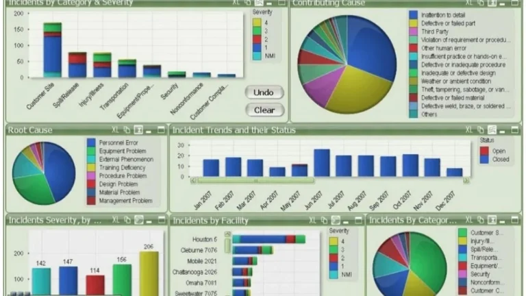
A founder of a 6 location coffee chain showed me her dashboard last month. It had 23 metrics on the main page. Daily revenue. Average transaction value. Items per basket. Foot traffic. Conversion rate. Labour cost percentage. Year-over-year growth. Same store sales. Loyalty signups. Plenty more.
Then I asked her one question: which of these tells you what to do tomorrow morning?
She paused. None of them, really. They told her how the business was doing. They didn’t tell her what to do about it.
That’s the KPI trap. It’s the gap between measuring a business and running a business. Most operations dashboards fall into it without anyone noticing, because the metrics on the screen all look reasonable on their own. The problem isn’t any single number. The problem is that the whole set of numbers doesn’t add up to a decision.
The KPI trap is so common that I’d estimate four out of five dashboards I see have it. And it’s usually not the operator’s fault, it’s the way the dashboard was built. Whoever built it loaded it up with what was easy to measure, instead of what was useful to know.
What the KPI trap actually looks like
Picture a Monday morning. An ops manager opens the dashboard. Revenue is down 4% week-on-week. Transactions are up 2%. Average transaction value is down 6%. Labour cost as a percentage of revenue is up 1.5 points.
Now what? This is the KPI trap in real time.
If you’re the manager, you don’t know. You can see something has shifted, but the dashboard doesn’t tell you what to change. Are people buying smaller items? Did a promotion end? Did one of your six locations have a bad week and drag the average down? Did the weather affect foot traffic? Is one staff member crushing it and pulling up the conversion numbers everywhere else?
The dashboard has data. It doesn’t have answers. That’s the KPI trap in one sentence: the dashboard tells you the business changed, but not what changed or what to do about it.
The reason this matters is simple. A dashboard you can’t act on isn’t a dashboard. It’s a report. And operators don’t need more reports, they have plenty.
Why so many dashboards measure the wrong things
Three reasons, all common, all fixable.
The first reason is that the easiest metrics to calculate are the ones that get tracked. Revenue, transactions, basket size, foot traffic, these come straight out of the POS or the booking system. You don’t need to do anything special to get them. They’re free. So they end up on the dashboard by default, whether or not they actually help anyone make a decision.
The second reason is that finance and operations need different things. Finance wants the totals. Revenue, margin, year-on-year comparisons. Operations wants distribution. Which location, which day, which hour, which staff member. Most dashboards are built by someone with a finance brief, and then handed to operations, who can’t act on them. The numbers are correct. They’re just answering the wrong question.
The third reason is that nobody asks the “so what” question before building. Most dashboards start with the question “what data do we have?” The right question is “what decisions do we need to make weekly?” If the dashboard doesn’t connect to a decision, the metric on it is decoration. It looks busy. It feels rigorous. It doesn’t change behaviour.
The KPI trap isn’t a tooling problem. It’s a design problem. Power BI, Tableau, Streamlit, they’ll all fall into the trap if you point them at the wrong set of questions.

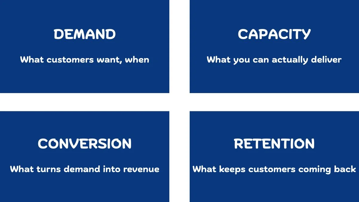
The four KPI categories that actually drive decisions
When I build dashboards for operators, I keep coming back to four categories. None of them are revolutionary. What’s different is that every metric on the dashboard has to fit into one of them. If it doesn’t, it comes off, and that single discipline is what gets a dashboard out of the KPI trap.
Demand metrics. What customers want, and when. Trip starts by location and hour. Bookings by day of week. Foot traffic by store and time. Demand metrics tell you what the customers are doing. They’re the input side of the business.
Capacity metrics. What you can actually deliver. Available bikes, available drivers, available rooms, available staff hours. Capacity metrics tell you what you have to work with. They’re the supply side.
Hospitality has its own version of this distinction, I wrote separately about why utilisation vs occupancy is the metric pair that costs hotels real money.
Conversion metrics. What turns demand into revenue. Booking-to-arrival rate, foot-traffic-to-transaction rate, quote-to-close rate. Conversion metrics tell you how well demand is being met when it shows up.
Retention metrics. What keeps customers coming back. Repeat purchase rate, churn, customer lifetime value, returning bookings. Retention metrics tell you whether the work you’re doing today is building a business or just running a business.
On a recent customer analytics project I worked on, retention was where the KPI design mattered most. The project segmented around 206,000 customers across roughly 32 million transactions into 11 strategic groups, protect, grow, maintain, reactivate. Every metric on the final dashboard had to map to one of those four actions. If a number couldn’t tell the commercial team whether to protect a customer, grow them, maintain them, or reactivate them, it didn’t go on the screen. That single rule cut the original metric list almost in half. The dashboard became useful the moment it stopped trying to describe customers and started telling the team what to do about them.
Every operations dashboard should answer four questions: What do customers want? Can we deliver it? Are we converting it? Are they coming back?
If a metric doesn’t answer one of those four questions, it’s not earning its spot on the screen. That single rule is enough to cut most dashboards in half.
Lagging metrics vs leading metrics
There’s one more distinction inside the KPI trap that’s worth flagging. It’s the difference between lagging and leading indicators.
Most of the trap-style KPIs are lagging indicators dressed up as decision drivers, the deeper question of lagging vs leading indicators sits underneath this whole problem.
A lagging indicator tells you what already happened. Monthly revenue. Last quarter’s growth. Year-on-year comparison. Lagging indicators are useful for boards and investors. They’re terrible for daily operational decisions, because by the time the number shifts, the cause is two months behind you. I wrote about why monthly sales reports stop being useful past a certain size, the lagging indicator problem is the same problem in a different shape.
A leading indicator tells you what’s about to happen. Booking pace for the next four weeks. Inventory levels at peak demand stations. Repeat customer signups this week. Leading key performance indicators give you time to act before the lagging numbers show the damage.
Most dashboards I see are 80% lagging metrics and 20% leading metrics. The mix should be the other way around. The operator running the business needs to see what’s coming, not what already happened, they were there when it happened.
Flipping that ratio is one of the highest leverage changes you can make to any operations dashboard, and one of the fastest ways out of the KPI trap.
Why this gets worse for multi location businesses
The KPI trap is bad enough for a single site business. It compounds quickly when you have multiple locations, every blind spot multiplies by the number of stores, and the KPI trap multiplies with it.
Take any of the four KPI categories, demand, capacity, conversion, retention, and now multiply them by 6, 12, or 40 locations. The dashboard either becomes unusable, or it averages everything together to fit on one screen. Both options are bad. Averages hide the variance you actually need to see, and a 200 row table nobody can read isn’t useful either.
This is where a structured framework for comparing locations the right way becomes the difference between a dashboard that works and a dashboard that creates more confusion than it solves. The metrics on the dashboard need to be roll-uppable and drillable at the same time, you should be able to see the network average and one click later see which location is dragging it down.
If a custom dashboard isn’t quite what you’re after, maybe you need data cleaned, an ad hoc analysis run, or ongoing reporting support, those are services I offer too.
How to audit your dashboard for the KPI trap
If you already have a dashboard and you suspect it’s caught in the trap, here’s a 20 minute audit that will tell you for sure.
Open your dashboard. For every single metric on the main screen, write down the answer to two questions.
Question one: what decision does this metric help me make? If the honest answer is “it tells me how the business is doing,” it’s a lagging metric and probably belongs on a monthly board pack, not a daily operations dashboard. If the answer is “it tells me what to do next week,” keep it.
Question two: which of the four categories does this fit into demand, capacity, conversion, or retention? If it doesn’t fit any of them, it’s probably noise. Some metrics genuinely sit between categories, and that’s fine. The point is to force yourself to justify why each number is on the screen.
Count how many metrics survive both questions. If it’s fewer than half of what’s currently on the dashboard, you’re in the KPI trap. Strip the rest out.
A useful dashboard usually has between 8 and 14 metrics on the main view. Fewer than 8 and you’re missing important inputs. More than 14 and the operator’s eye stops focusing on any of them. The sweet spot is somewhere in that range, weighted toward leading indicators and built around the foundation of real operational visibility.

What to do about it
The fix for the KPI trap isn’t to build a new dashboard from scratch. It’s to ask better questions before deciding what goes on the screen.
Three questions, in order:
What decisions do I need to make weekly? Write them down. Not the strategic ones, the operational ones. “Should I add staff on Wednesday afternoons at the Brunswick store?” “Should I restock the bike dock at W 21 St before 4pm?” “Should I follow up with the customers who booked but didn’t show up last week?”
What metrics would actually help me answer those questions? Now, and only now, work out which numbers belong on the dashboard. Most of the time you’ll find that half of what’s currently on the screen doesn’t help with any of the decisions you actually need to make.
What’s the smallest set of metrics that covers the decisions? Don’t add anything for completeness. Don’t add anything because it’s easy to calculate. Don’t add anything because it looks impressive in a meeting. Add what you’ll use. Cut what you won’t.
Even the right KPIs won’t help if the dashboard sits unused, here’s why teams ignore dashboards and what actually changes that.
That’s the whole job. The dashboard that comes out of those three questions is a custom dashboard built around the decisions you actually need to make, not a wall of numbers that looks rigorous and changes nothing.
The KPI trap is what happens when the dashboard becomes the goal. The fix is to remember the dashboard was never supposed to be the goal. The decisions were.
Elia Lanzuise builds custom operational dashboards for businesses with hidden demand patterns, multi location retail, transport and logistics, booking based services, e-commerce, and hospitality. The work starts with the decisions you need to make, not the charts.
See how the dashboard service works → or explore other data services if you’re not sure what you need.
Pingback: Your Monthly Sales Report Is Broken - Here's the Fix
Pingback: Multi-Store Retail Analytics: A Proven Framework
Pingback: Utilisation vs Occupancy: The Costly Hotel Mistake
Pingback: The Hidden Cost of Poor Operational Visibility in Business