
The daily total looked normal: 134,000 trips, which looked like a strong day. The operations team was reviewing the week and everything checked out at the day level.
Then someone broke it down by hour. The picture changed completely.
Between 4am and 6am, the system was practically empty, fewer than 100,000 trips for the entire two-hour window across the whole year. Between 5pm and 6pm, a single hour, the system handled 2.69 million trips. The same network, the same fleet, the same city. The hour-by-hour reality of that “normal” day was wildly uneven, and the team had been making operational decisions off the daily average for months.
This is what hourly demand patterns reveal that daily and weekly numbers can’t. The averages flatten everything. The hours tell you where the operational pressure actually lives. And for transport, delivery, mobility, and any business with timed customer flow, the hourly view is where the real decisions get made.
Why daily totals lie to operators
A daily total tells you the volume but hides the shape of the day.
Two days with the exact same total can look completely different at the hour level. One might be a smooth, gentle curve. The other might be a flat morning, a sharp lunch spike, a dead afternoon, and a brutal evening rush. Same number on the report. Totally different operational problem.
When operators only see the daily number, they staff to the average. Hourly demand patterns disappear behind the daily total, and the staffing model quietly drifts away from reality. They allocate vehicles to the average. They plan maintenance windows around the average. But customers don’t experience the average. They experience the worst hour. If you have enough capacity for the daily total but not enough for the 5pm spike, your service breaks down every weekday at 5pm, and your daily report says everything is fine.
Hourly demand patterns expose this gap. They show you the moments where your business is actually strained, not the moments that average out the strain.
For broader context, NACTO research on urban mobility patterns is useful because it shows how transport demand changes across different times, locations, and user behaviours.
What the hourly view actually shows
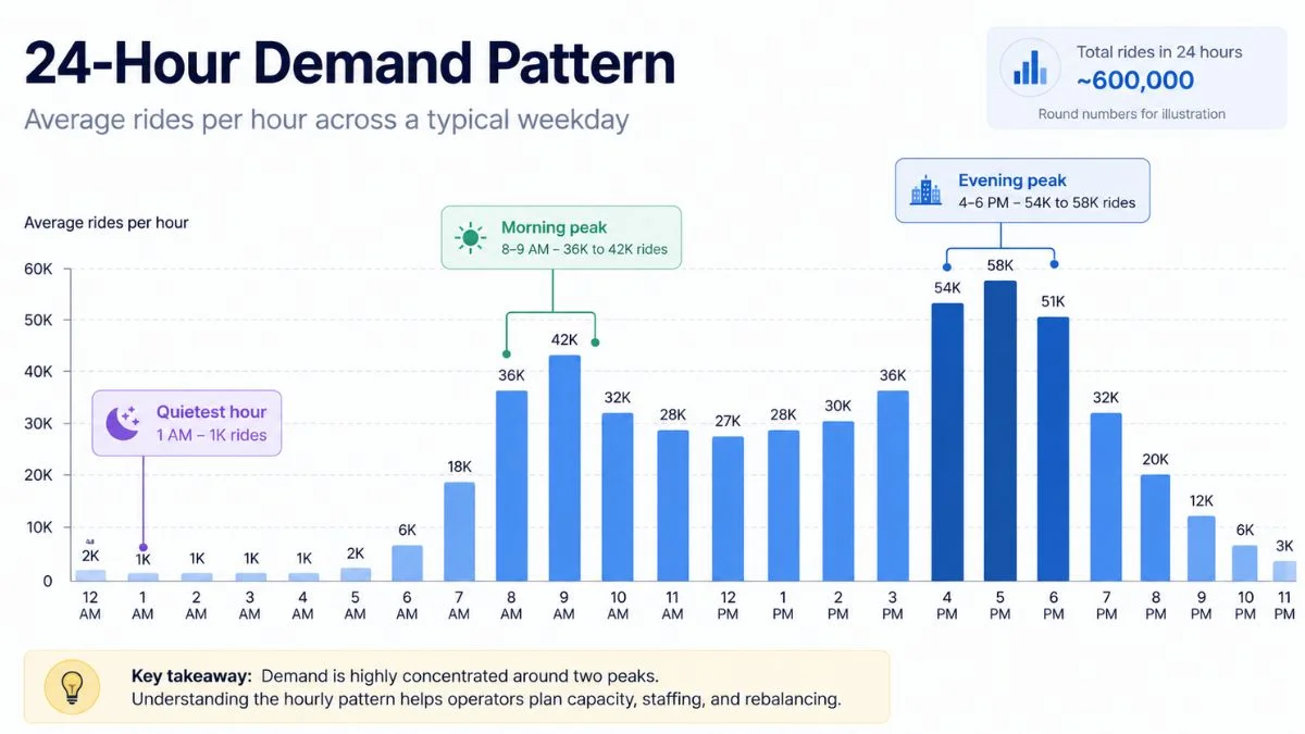
Most transport and mobility businesses, once they look at their data hour by hour, find the same shape: very low overnight, a sharp ramp from around 6am, a morning peak somewhere between 8am and 9am, a midday plateau, a much bigger afternoon and evening peak between 4pm and 6pm, then a gradual fade through the evening.
In the bike-share dataset I worked with for a transport analytics case study, the pattern was textbook. The lowest hour was 4am, with 93,693 trips across the full year. The highest was 5pm, with 2,686,408 trips. That’s a 28× swing between the quietest and busiest hour. The three peak hours (4pm, 5pm, 6pm) accounted for nearly 7.5 million trips combined, more than the entire overnight period across twelve months.
The morning rush was real but smaller than the evening rush. That’s a useful detail. Most operators assume the morning and evening commute are roughly mirror images. They’re not. Evening demand was substantially higher and lasted longer. That changes how you allocate staff, fleet, and rebalancing crews if you take it seriously.
This kind of asymmetry is invisible in a daily report. You can only see it through hourly demand patterns, broken out hour by hour and compared side by side.
The three operational decisions hourly demand patterns sharpen
Hourly data isn’t useful on its own. It’s useful because it changes the answers to specific operational questions you’re already asking.
Staffing and shift design. If your peak hour is 28 times busier than your quiet hour, a flat staffing model is wasting money in one direction and breaking the service in the other. The hourly view tells you where to add staff (the 4pm-6pm window in this example) and where you can comfortably cut (the 1am-5am window). Most businesses I see are overstaffed in the late morning and understaffed in the late afternoon, because the daily average pulls them toward the middle. Hourly demand patterns pull staffing decisions back toward where the actual pressure is.
Capacity allocation and rebalancing. For transport operators, “rebalancing” means moving vehicles or assets from where they are to where they’re needed. Hourly demand patterns tell you exactly when to rebalance. In the Citi Bike data, the right answer was not “rebalance once in the morning.” It was “rebalance heavily before the 4pm wave starts, with a second smaller cycle around 7am for the morning commute.” A daily-only view would have suggested one rebalancing cycle. The hourly view showed two, with very different sizes.
Maintenance and downtime planning. The quietest hours are when maintenance, cleaning, system updates, and stock replenishment should happen. Without hourly demand patterns, businesses often run maintenance during what they assume is a quiet period, but if they checked the data, they’d find their assumed quiet period actually has substantial demand. The 4am-5am window is genuinely quiet. The 11am-noon window often isn’t, even though it feels quieter than the lunchtime spike. The data tells you the truth.
When I work with operators on this, the maintenance-window conversation is often the one that pays for the whole project. Moving a daily reset from 11am to 4am usually recovers several hundred lost transactions a week.
Why hourly patterns get stronger when you add weekdays
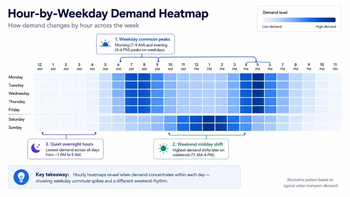
A useful refinement: don’t just look at “the average for each hour.” Look at “the average for each hour, broken down by day of the week.”
Sunday at 5pm and Tuesday at 5pm are not the same business. A retail location might see Tuesday at 5pm as a strong commuter window and Sunday at 5pm as a slow family-shopping period. A transport network might see Tuesday at 5pm as peak commute and Sunday at 5pm as recreational. The single “5pm” number averages those two realities together and makes both invisible.
The slightly more advanced version of the hourly view is the hour-by-weekday heatmap. Rows are the days of the week. Columns are the hours of the day. Each cell shows the demand for that specific hour on that specific day. Suddenly you can see that your real peak isn’t “5pm”, it’s “Friday at 5pm and Saturday at 11am.” Two completely different operational events. The staffing pattern for each is different. The stock pattern is different. The communication and marketing pattern is different.
Custom dashboards are one of several data services I offer. The hourly heatmap is one of the most useful single views I build for transport, hospitality, and multi-location retail operators, because the patterns it exposes are almost always actionable.
A small note on what “peak” actually means
Operators often use the word “peak” loosely. The hourly view makes you precise about what you mean.
There’s the single peak hour, the busiest hour of the entire dataset. There’s the peak window: the cluster of busy hours around the peak. There’s the daily peak: the busiest hour of each day, which can shift around. And there’s the anomaly peak: an unusually busy hour that doesn’t fit the normal pattern (a one-off event, a weather effect, a system disruption).
These four “peaks” need different operational responses. The single peak hour informs annual capacity planning, how much fleet, staff, or stock you need at maximum. The peak window informs shift design, when staff should be on the floor. The daily peak informs daily operations, what the manager should expect to manage today. The anomaly peak informs investigation, what’s different about a strange-looking hour.
Most businesses treat all four as the same thing. Hourly demand patterns force you to separate them, and the separation is usually where the real operational improvements come from. Once you’ve read hourly demand patterns this way for a few weeks, the four kinds of peak stop blurring together in your head.
Why the hourly view exposes weak spots in the operational model
There’s a quieter benefit to looking at hourly demand patterns. It reveals where your business model assumes a smooth day that doesn’t actually exist.
A multi-store retailer that opens at 9am and closes at 9pm is operating for twelve hours, but probably doing 70% of its volume in five of them. If staffing, lighting, opening hours, and store-level marketing aren’t reflecting that, you’re paying full operational cost for hours that produce a fraction of the revenue.
A transport operator running fleet vehicles for 24-hour availability might find that the 1am-5am window represents less than 2% of total demand. That doesn’t mean shutting down overnight service. It means having an honest conversation about whether the cost of overnight coverage is matched by the value of overnight demand.
A delivery operator with a fixed 8am-8pm shift pattern might find that demand peaks at 6pm and is still strong at 9pm. The shift pattern is missing the busiest tail of the day because it was set before anyone looked at the hourly data.
Each of these is the kind of decision a daily report can’t surface. It needs the hourly cut, and hourly demand patterns are usually the fastest way to make the case for change to managers and owners who’ve been planning off averages for years.
What gets harder once you have the hourly view
Honest concession: the hourly view creates new operational complexity, not just clarity.
Once you can see that your business is wildly different at 4pm than at 11am, you have to decide what to do about it. That can mean harder conversations with staff about shift patterns, harder conversations with managers about capacity decisions, and harder conversations with vendors about delivery windows. The hourly view doesn’t make operations easier, it makes operations more accurate, which sometimes means more work.
The trade-off is worth it for any business where customer experience varies by time of day. But it’s a real trade-off. Some operators look at the hourly view, decide it’s too much to act on, and stick with the daily average. That’s a defensible choice if the volume swings are small. It’s a costly choice if the swings are large.
The 28× swing between quietest and busiest hour in the bike-share data is not unusual for transport. Multi-location retail typically sees 5× to 8× swings within a single day. Restaurants and bookings businesses can see 10× to 15× swings. If your business has that kind of shape, the hourly view is paying for itself within the first month.

How to start without rebuilding your reporting stack
You don’t need a new dashboard, a new tool, or a new vendor to get an hourly view. You need three things:
Timestamped transaction data. Most modern point-of-sale systems, booking systems, and operational platforms record exact times automatically. If your data already has timestamps, you have the raw material. If it doesn’t, that’s the first thing to fix, and it’s usually a configuration change, not a system change.
A way to group by hour. This is one line of code, one spreadsheet formula, or one click in most BI tools. Group by hour-of-day, sum the volume, sort. That’s the simplest hourly view.
A way to see it visually. A bar chart with 24 bars is usually enough. The peak jumps out, the trough jumps out, and the shape of the day becomes obvious within seconds.
For most operators I work with, the first hourly chart they ever see produces an audible reaction. Either they say “I knew it”, and they did know it, but they had no way to prove it before. Or they say “I had no idea it was that uneven”, and now they have to decide what to do about it.
Either way, that first chart is one of the highest-leverage things you can add to an operational dashboard. Hourly demand patterns become a permanent operational reference once the team starts using them, not a one-off analysis. The data is already there. The view is missing.
If you want to see what hourly demand patterns look like in a fully built-out operational dashboard, the Citi Bike case study breaks the day into hours and shows where the operational pressure actually sits, including how the hourly view changed the recommendations on rebalancing, fleet allocation, and staffing.
The daily total tells you whether you had a good day. Hourly demand patterns tell you whether you ran a good day. Those are different questions, and operators eventually need answers to both.
I build custom operational dashboards for businesses with hidden demand patterns, multi-location retail, transport and logistics, booking-based services, e-commerce, and hospitality. The work starts with the decisions you need to make, not the charts.
See how the dashboard service works → or explore other data services if you’re not sure what you need.
Pingback: Powerful Transport Seasonality Planning for Mobility Ops
Pingback: Citi Bike Case Study: A Powerful Mobility Dashboard Build
Pingback: The Fleet Allocation Problem: How Smart Data Wins