It’s a Tuesday in late January. Your weekly trips are down 38% versus the previous Tuesday. The team starts hunting for explanations, was it a competitor promotion, did the marketing campaign end, is something wrong with the booking flow, did one of the locations underperform? Three people spend the morning on it.
The answer was the weather. Average temperature dropped from 9°C to –4°C across those seven days. Nothing else changed. Weather and demand had moved together, and the report didn’t show it.
Most operational reports don’t include weather. They include revenue, trip counts, bookings, conversion rates, average ticket size, utilisation, the things your finance team cares about. Weather sits outside the system. So when weather moves demand, the report shows the symptom and hides the cause, and your team wastes a morning chasing internal explanations for an external pattern.
This article is about why weather and demand are more tightly coupled than most operators assume, what that means for forecasting and capacity planning, and how to bring weather into your operational view without turning it into a science project.
The hidden variable in plain sight
Of all the external variables in your business, weather and demand are one of the most predictable pairings and one of the most ignored. You don’t need a meteorology PhD, you need historical temperature, precipitation, and wind speed for your operating regions, joined to your operational data by date. That’s it. The data is free, the merge is mechanical, and the insight is usually surprising.
The reason it gets ignored is not technical. It’s organisational. Weather doesn’t fit into the categories that operational reports were built around. Sales, marketing, operations, finance, none of them own “the weather.” So no one tracks it, and the demand pattern gets attributed to whichever team had a campaign running that week. Weather and demand share no organisational owner, so no one tracks the link.
This is the same failure pattern as a monthly sales report that tells you the number but not the reason, the report describes outcomes without surfacing the variables that produced them. You can’t act on a number you can’t explain.
What a year of bike data showed
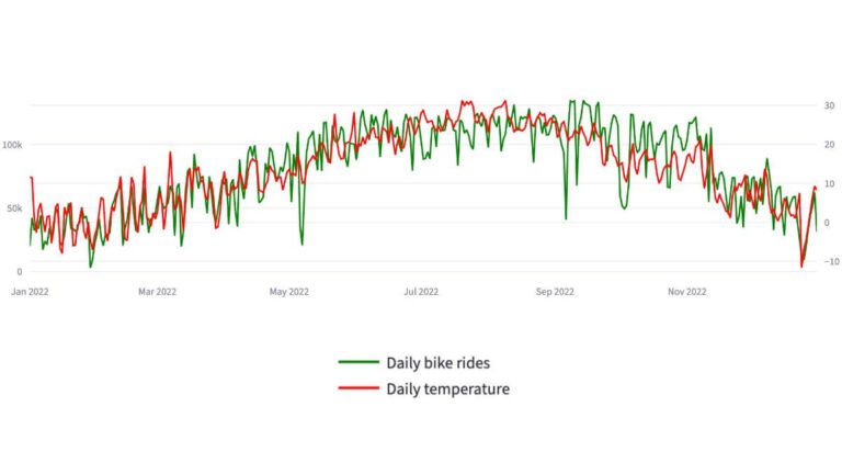
I built a strategic dashboard on the 2022 NYC Citi Bike dataset, 29.7 million cleaned trip records and merged it with NOAA daily temperature data for LaGuardia Airport. The correlation between daily trip totals and average daily temperature came out at approximately 0.85.
The full walkthrough of how that dashboard was built, from 29 million trip records through to the operational recommendations, is here.
For an operational dataset that size, 0.85 is not a soft signal. It’s strong enough that weather and demand can be treated as a forecastable pairing, with temperature acting as a forward-looking input rather than a post-hoc explanation.
The contrast across the year was dramatic. The busiest day in the dataset was 14 September 2022, 134,851 trips, average temperature 22.9°C. The quietest day was 29 January 2022, 2,809 trips, average temperature –4.8°C. Same city, same network, same fleet. A 48× difference in demand explained largely by temperature.
The monthly view was just as clear. August recorded 3.57 million trips. January recorded 1.01 million. The summer months June, July, August, September sat between 3.34 and 3.57 million each. The winter months sat between 1.01 and 1.59 million. The shape of the year was not a marketing artefact. It was thermodynamic. Weather and demand were the same story, told twice.
The operational implication is not “ride a bike when it’s warm.” It’s that fleet allocation, maintenance scheduling, staffing for rebalancing operations, and station capacity planning all need to expect this swing, and the swing is forecastable two weeks out from a free weather feed.

Why this matters beyond transport
Transport and mobility businesses feel the weather and demand link most obviously. But the principle generalises further than people expect.
Retail. Foot traffic on high streets correlates with rainfall and temperature. A multi-location retailer running like-for-like comparisons across stores in different climate zones is comparing operational performance partly contaminated by weather. Promotional lift analyses that don’t control for weather are often measuring the weather, not the campaign. A multi-location retailer running like-for-like comparisons across stores in different climate zones is comparing operational performance partly contaminated by weather. Promotional lift analyses that don’t control for weather are often measuring the weather, not the campaign. This compounds with a deeper structural problem, network averages already hide variance between stores, and weather effects get buried inside that variance twice over.
Hospitality. Restaurant covers, hotel walk-ins, outdoor dining capacity, beverage mix, all weather-sensitive. A restaurant operator who can’t explain a slow week often spent that week competing against a heatwave or a cold snap rather than against a rival venue.
For Australian operators specifically, the practical integration steps for hotels and hospitality venues follow a slightly different pattern: local BoM data, daily granularity, and seasonality corrected weather deviation (the column that actually matters).
E-commerce. Less obvious but still real. Heatwaves shift category demand toward summer goods, cold snaps drive indoor categories, severe weather events disrupt delivery networks and inflate apparent order issues that have nothing to do with your operations.
Service businesses. Salons, gyms, fitness studios, urgent dental and medical appointments, bookings rise and fall with weather in ways that are predictable if you look, and inexplicable if you don’t.
Every one of these examples is a case where weather and demand move together and the operational report is silent about it.

The forecasting use case
The reason operators care about this is not curiosity. It’s that knowing demand is going to fall by 30% next week lets you do things differently, adjust staffing rosters, defer non-urgent stock orders, redeploy field teams to maintenance work, accelerate rebalancing in transport networks, run weather-contingent promotions for indoor categories.
Two-week temperature forecasts are reasonably accurate at the regional level. They are far more accurate than your internal demand forecast, which is usually a flat extrapolation of last quarter. Bringing weather and demand into the same forecasting layer doesn’t replace the rest of the model, it adds a coefficient that catches the swings the internal model can’t see.
For a transport business specifically, the operational recommendation from the Citi Bike analysis was direct: scale bike availability down by 30–40% between November and April, but protect supply at consistently high-demand stations and around peak commuter windows. That’s not a finance decision. It’s an operations decision. And it depends entirely on having weather and demand in the same view.
If your existing reporting can’t answer the question “how much of last month’s drop was weather,” you need the kind of operational visibility that combines internal performance data with external variables. The dashboards I build for transport, logistics, and mobility operators do this explicitly, weather, time of day, and route-level demand sit in the same view as the operational KPIs, so the team stops chasing the wrong explanations. If you want to see what that looks like in practice, the custom dashboard service is here.
What clean weather and demand integration actually looks like
The technical part of joining weather and demand data is not difficult. The hard part is doing it without making the report unreadable.
For the practical walkthrough of the data side, where to get the weather data, how to match it by date, and the unit checks that stop the analysis from breaking, I’ve written a plain language guide to weather data integration.
A few principles that hold across industries:
Daily, not hourly, for the main view. Hourly weather data exists and is useful for specific questions, restaurant covers, urgent transport patterns, but daily averages are the right resolution for most operational reporting. They smooth noise without losing the signal.
Average temperature, plus precipitation, plus a binary “severe weather day” flag. Three variables cover most of the operational signal. More variables add complexity faster than they add insight.
Convert units once, at ingestion. The NOAA API returns temperature in tenths of a degree Celsius. That has to be converted before merging with operational data, or every chart will be 10× wrong and nobody will notice until a meeting. (NOAA’s daily summaries documentation explains the formats; it’s straightforward but easy to miss.)
Lag the variable where appropriate. Some demand patterns respond to today’s weather. Others respond to a forecast that customers saw two days ago. Service businesses with advance bookings often show the second pattern. Test both and use whichever fits.
Show the weather and demand correlation in the dashboard. Not as a coefficient, operators don’t act on r-values, but as a side-by-side chart across the year. The eye reads the relationship faster than any number.
The same logic applies to spatial patterns: a column of trip counts hides routes that a map immediately reveals, if you want to know more read the article Geospatial analysis catches patterns spreadsheets structurally cannot.

When weather is not the explanation
A reasonable concession: weather is not the only variable, and not every demand swing is weather. Promotional periods, public holidays, major sporting and cultural events, supply disruptions, competitor activity, and broader macroeconomic shifts all move demand independently.
The point isn’t that weather explains everything. It’s that weather explains a meaningful chunk of variance that most operational reports currently attribute to internal factors or leave unexplained. Once weather is in the model, the remaining variance is genuinely investigable, and your team stops misdiagnosing the cause.
A useful test: pull last year’s worst-performing weeks and best-performing weeks, then check what the weather was doing on those weeks. If the pattern is obvious, weather has been silently shaping your reports the whole time. If the pattern isn’t obvious, the swings are genuinely operational, and you have a different problem to solve.
Custom dashboards are one of several data services I offer, if a full dashboard build isn’t where you are yet, an ad-hoc weather and demand analysis is a smaller starting point that often surfaces the pattern fast enough to act on this quarter.
The full seasonal picture, month-by-month, peak versus trough, is its own planning conversation. Transport seasonality and mobility demand patterns deserve their own framework, separate from the day-to-day weather effect.
What to do this week
If you’re an operations leader and the argument here lands, three concrete next steps:
Pull weather data for your operating region for the last 24 months. NOAA in the US, the Met Office in the UK, the Bureau of Meteorology in Australia. All free. Daily averages are enough.
If you’re wondering what actually merging the two datasets looks like, file format, matching by date, the conversions that catch people out, I’ve written a practical guide to weather data integration.
Join it to your weekly demand data and chart both on the same axis. No statistics required. Look at the lines. The relationship will either jump out or it won’t.
If it jumps out, write down the operational decisions that change. Staffing. Inventory. Maintenance windows. Marketing timing. Capacity planning. That list is the operational difference weather and demand make together and the case for putting both into your standing reporting layer.
If it doesn’t jump out, you’ve ruled out a major confounding variable in 30 minutes, which is also worth knowing.
I build custom operational dashboards for businesses with hidden demand patterns, multi-location retail, transport and logistics, booking-based services, e-commerce, and hospitality. The work starts with the decisions you need to make, not the charts.
See how the dashboard service works → or explore other data services if you’re not sure what you need.
Pingback: Citi Bike Case Study: A Powerful Mobility Dashboard Build
Pingback: The Hidden Cost of Poor Operational Visibility in Business
Pingback: Weather Data Integration: A Smart Practical Guide
Pingback: Powerful Transport Seasonality Planning for Mobility Ops
Pingback: The Fleet Allocation Problem: How Smart Data Wins
Pingback: Geospatial Analysis: Smarter Operations, Better Results
Pingback: Weather Data Integration: The Best Way to Boost Efficiency