
A regional manager opens the Monday report. Same-store sales are up 4% across the network. The number sits there, calm, slightly green. The manager forwards it to the leadership team with a brief note: ‘Solid week.’ This is how most weeks end in multi location operations, a number that looks fine, forwarded forward.
What the number is hiding: two stores are up 22%, one store is flat, four stores are down between 3% and 8%, and the highest-performing store is masking a quiet collapse at the worst one. The average is mathematically correct. It is also operationally useless.
This is the central problem with averages in multi location operations. They were designed for finance, not for operations. They compress signal that operators need to see, which store, which day, which product line, which shift, into a single number that’s true on paper and wrong in practice. By the time the average swings far enough to be alarming, the underlying issue has been building for three months.
This article is about why averages mislead multi-location operators, where they specifically break down, and what to use instead.
The averaging problem in one sentence
An average is what you report when you don’t want to make a decision.
It’s a defensible number, nobody can argue with arithmetic. It’s also a flattening number, because it tells you the centre of gravity of your network while saying nothing about the spread, the outliers, or the trend at individual locations. For finance, that’s fine. Finance wants to know whether the whole business is profitable. For operations, it’s catastrophic, because operational decisions are made store by store, week by week. Multi location operations live or die at the location level, not at the network level.
If you run a single location, averages are mostly harmless, you only have one store, the average is the store. The moment you have three or more, multi location operations create variance, and variance is where the operational information lives. Averaging it away is throwing the information out before you’ve read it.
A useful way to think about it: averages tell you the temperature of the room. Multi location operations need to know which seat is on fire.
This is a practical version of what statisticians call Simpson’s paradox, aggregated data telling a different story than the underlying groups.
Where averages specifically break down
Cross-location performance comparison. Network-wide same-store sales up 4% sounds fine. But if the top two stores are pulling +20% and the bottom two are bleeding –10%, the operational reality is two emergencies and two unexploited wins, none of which the headline number reveals. Comparing locations the right way means looking at each location against its own baseline, against comparable peers, and against its trajectory, never against a single network-wide average.
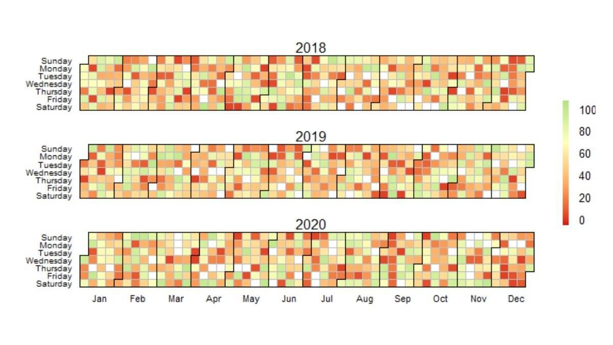
Day-of-week patterns. Average weekly footfall is one of the most misleading numbers in retail and hospitality. A store with 5,000 visitors per week could have 1,400 on Saturday and 200 on Tuesday, or it could have a flat ~700 per day. These are completely different operational businesses with the same average. Staffing schedules built from the weekly average will be wrong six days out of seven.
Hour-of-day demand. Same logic, narrower window. Average daily transactions tell you nothing about the lunch rush, the post-work surge, or the dead afternoon. Multi location operations that staff to the daily average are simultaneously overstaffed in the dead hours and understaffed in the peak hours, at every location, every day.
Product mix and basket size. Average basket value of $34 across the network is meaningless if one store sells low-margin convenience items at a $12 basket and another sells higher-margin services at a $58 basket. The averages mask which locations are commercially healthy and which are coasting on volume.
Customer or visit duration. Average dwell time, average appointment length, average ride duration, all routinely averaged to single numbers, all routinely hiding the bimodal distributions that operations needs to see. Two distinct customer segments often average together into a fictional “typical” customer that exists nowhere in the actual data.
Staff and labour productivity. Average sales per labour hour across a 12-location network. Same problem multi location operations hit everywhere else, the average lets the underperformers hide inside the network number. Some stores are running tight rosters and high productivity. Some are overstaffed and dragging the network.
In every case, the structural failure is the same: averaging across the variance that operations needs to see in order to act.
The slow decline case is one of the clearest examples, a single slow declining store can drag a network average for months without ever triggering a clear alarm.
What averages cost you, concretely
The cost of averaging in multi location operations shows up in three places, and none of them sit in a P&L line called ‘averaging error.’
Decisions delayed by weeks. A slow-declining store can drop 15–20% in real terms before the network average moves enough to raise an alarm. By the time the average reacts, the store has been underperforming for a quarter, the lease decision is harder, and the recovery plan starts from a deeper hole.
Wins that never get scaled. The other half of the same problem. A new layout, a local promotion, a manager change that’s driving a real result at one location gets buried inside the average. Nobody copies what they can’t see. The pattern stays local when it should have rolled out network-wide. This is the silent compounding cost of average-driven multi location operations, the wins you don’t scale add up faster than the losses you don’t catch.
Staffing mismatches. Rosters built from averages are systematically wrong at the day and hour level. The cost is split between paid hours that don’t produce revenue and unstaffed peaks that lose customers. Both halves of the cost are real, and both are invisible in averaged reporting.
If your reports for multi location operations are mostly averages and your decisions feel slow or reactive, those two facts are connected. This is the kind of structural reporting issue a custom operational dashboard is built to fix, not by adding more numbers, but by replacing averaged views with location-level, day-level, and hour-level views that actually map to the decisions you’re making.

The smart alternatives, in order of usefulness
Distributions, not means. Show the spread, not just the centre. A simple chart of all your locations ranked by the metric, best to worst, communicates more in one glance than the network average does in a paragraph. The eye picks up the shape of the distribution faster than any summary statistic. This single change to your reporting layer often surfaces store-level problems that have been hiding for months.
Quartiles or deciles. When you have 10+ locations, split the network into top 25% and bottom 25% (or top/bottom 10%) and report those separately. The top quartile and the bottom quartile are usually doing completely different things. Reporting them as one average mixes the two stories.
Like-for-like baselines, not network averages. Each store should be measured against its own historical baseline first, then against comparable peers second, then distantly against the network. A store in a tourist district is not the same operational business as one in a commuter suburb. Comparing them via a network average punishes the suburb store for not behaving like the tourist store, when both might be performing well against the right baseline. The right baseline is the foundation of fair multi location operations reporting.
Variance and trajectory, not point-in-time. “Sales were $24,000 this week” is a point-in-time number, and the operational instinct to compare it to last week or last month produces a meaningless single-pair comparison. Variance across the last 8 weeks, the trajectory over the last quarter, and the size of the gap between best and worst weeks, these are the operational questions worth asking.
Cohorted segments instead of “the average customer.” If you have repeat customers, members, or any kind of customer identifier, breaking demand into 3–4 behavioural cohorts almost always replaces the average customer with something more useful. The “average” customer is a statistical artefact. Real customers come in clusters.
None of these are technically difficult. They are reporting design choices. The reason most operators don’t have them is that the default reporting in most POS, booking, and BI systems is built around averages, and the system doesn’t push back when you keep using them.

A word on when averages are fine
A reasonable concession: averages are not always wrong. For finance reporting, board reporting, and any rolled-up view above the operational layer, averages are appropriate and necessary. The CEO doesn’t need to see every store every week, they need the network number, and the average is the right tool for that.
The problem isn’t averages existing. The problem is averages being the only view operations leaders ever see. The fix isn’t to ban them; it’s to push the operational layer one level deeper, so the people making operational decisions can see what the average is smoothing over.
A useful test: for every averaged number in your weekly report, ask whether you could make a different operational decision if you saw the underlying distribution. If yes, the distribution belongs in the report. If no, the average is fine. Most operators run this exercise once and realise 60–70% of their averaged metrics fail the test. Multi location operations, in particular, almost always fail it on the day-level and store-level metrics.
If your reporting needs a deeper layer but you’re not sure whether the answer is a custom dashboard, a one-off analysis, or a data cleaning project first, the full list of data services I offer is here, the right starting point depends on what your data looks like today.
What multi location operations look like in practice
The shift from average-driven to distribution-driven reporting is not a tooling change. It’s a question of which view your operations team opens first on a Monday morning.
The right first view for multi location operations is rarely the network total. It’s usually:
A ranked list of every location against its own baseline, with the worst and best three flagged. A day of week heatmap showing where staffing pressure is concentrated. A trajectory chart for each store over the last 8-12 weeks. A side by side of like-for-like peers, not network averages.
The same averaging problem shows up at the weekly level too: chain wide averages can hide day of week patterns in retail (in individual locations that might need optimisation).
These four views together replace most of what an averaged weekly report tries to do, and they replace it with information operators can actually act on. The Monday meeting stops being a number-reading exercise and starts being a decision-making one. That shift is the difference between reporting and real operational visibility.
The averaged report will still exist. Send it to finance. Keep the operational layer separate, and keep it specific. The variance is where the work is.
For multi-location retailers specifically, a five-layer comparison framework, baseline, peers, trajectory, role, network, replaces the network average view that most retailers still anchor on.
I build custom operational dashboards for businesses with hidden demand patterns, multi location retail, transport and logistics, booking-based services, e-commerce, and hospitality. The work starts with the decisions you need to make, not the charts.
See how the dashboard service works → or explore other data services if you’re not sure what you need.
Pingback: How Every Multi-Location Business Hides Its Biggest Wins
Pingback: The Hidden Cost of Poor Operational Visibility in Business
Pingback: Multi-Store Retail Analytics: A Proven Framework
Pingback: Weather and Demand: Why Reports Miss the Biggest Variable
Pingback: Slow Declining Store Warning Signs Before the P&L
Pingback: Essential Day of Week Patterns in Retail: A Smart Guide
Pingback: Utilisation vs Occupancy: The Costly Hotel Mistake