
A four store retail chain in Sydney looked healthy on paper. Group revenue was up 3% year-on-year. The monthly P&L was clean. The owner was thinking about opening a fifth location.
Then one of the four stores closed nine months later. Not because of a sudden crisis. Because it had been slowly bleeding for almost two years, and nobody had spotted the pattern in time to do anything about it.
This is the slow declining store problem. It’s not the store that crashes overnight after a bad event, those are obvious. It’s the store that loses 2% of its weekly transactions, then 3%, then 4%, while the headline numbers look fine because the other stores are picking up the slack. By the time the monthly P&L shows a clear decline, the store has usually been in trouble for six to twelve months.
The good news is that a slow declining store almost always sends signals long before the P&L catches up. The signals are in the data. They’re just not in the report that lands on the operator’s desk each month.
Why The P&L Is The Last Place To See A Slow Decline
The monthly profit and loss report is built for accountants, not operators. It’s a financial document. Its job is to summarise. Summary numbers are exactly the wrong tool for catching a slow declining store.
Three structural reasons.
Monthly aggregation washes out the trend. A store losing 2% of transactions per month looks fine in any single month. The trendline only becomes obvious when you string six months together. By then, the cumulative drop is 12%, the store is in real trouble, and the team has spent half a year not noticing.
Group level reporting masks the individual store. A slow declining store inside a network of stable or growing locations gets hidden in the average. The group is up 3%. Three stores are up 5%. One store is down 4%. The headline doesn’t reveal which is which. Even metrics like same store sales can still miss the operational story if they are reviewed too late or only used as a headline number. Averages are exactly what hide a slow decline, and most multi-location reporting leans heavily on averages.
P&L numbers are lagging indicators. Revenue, margin, and growth percentages tell you what already happened. By the time they shift, the cause has been working on the business for months. This is the lagging indicator problem at the heart of monthly reporting, it’s a structural blind spot, not a fixable error in any specific report.
The P&L isn’t broken. It’s doing the job it was designed for. It’s just the wrong tool for catching a slow declining store while there’s still time to act.

The Five Early Signals Of A Slow Declining Store
When I look at multi-location retail data, five signals consistently appear before the financial numbers shift. Any one of them on its own is noise. Two or three together is a pattern. All five is a slow declining store that’s six months ahead of the P&L.
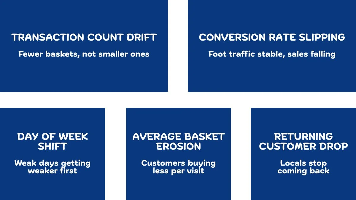
Signal one: transaction count drifts down while basket size stays flat. This is usually the earliest signal. Fewer customers are coming in, but the ones who do are buying the same as they always have. The total revenue might look unchanged because basket size compensates for a while, but the customer base is shrinking. This is a leading indicator. By the time basket size starts dropping too, the decline has accelerated.
Signal two: conversion rate slips while foot traffic stays stable. This is a different kind of warning. The same number of people are walking through the door, but fewer of them are buying. Something has changed about the in store experience, staff, layout, stock availability, pricing and customers are walking out without spending. Foot traffic counters and POS data together catch this; either one alone misses it.
Signal three: weak days start getting weaker first. Most stores have strong and weak days of the week. The first place a slow decline shows up is in the already weak days. A store that’s slowly losing momentum will see Tuesday drop before Saturday drops. By the time the strong days slip, the slow decline has been running for months.
A related pattern that catches store level issues even earlier is day of week patterns in retail: comparing same-day, same-store performance against the rolling four-week average.
Signal four: average basket size starts eroding. This usually comes after transaction count has already been drifting. Customers aren’t just visiting less, when they do visit they’re buying less per trip. This is often the signal that a fixable problem has become a structural one.
Signal five: returning customer rate drops. The strongest signal that a store has lost its local base. Most healthy stores have a high percentage of repeat visits each month, locals who shop weekly or monthly. When that percentage starts dropping, the store has lost trust with its regular base, and getting it back is much harder than holding it.
Five signals. None of them appear on a standard monthly P&L. All of them are in the data you already have.
What This Looks Like In Real Numbers
Let me give you a concrete picture. Take that four store chain I mentioned at the start.
In month one, the troubled store had transactions of 4,200 and revenue of $128,000. Average basket size was $30.50. Returning customer rate was 64%.
Six months later, transactions had drifted to 3,950, a 6% drop. Revenue was $124,000, only 3% down because basket size had nudged up slightly. The store still looked broadly healthy in the monthly report. Returning customer rate had quietly slipped to 58%. Conversion rate had dropped from 38% to 33%. Tuesday and Wednesday revenue were down 11% and 9% respectively.
Twelve months in, the picture had compounded. Transactions were down 14%. Returning customer rate was 49%. Conversion had dropped to 28%. And finally, the P&L showed a clear problem, revenue was down 9% year-on-year and falling.
By the time the P&L flagged the problem, the store had been declining for a year. The signals had been there since month three.
Why This Matters More For Multi Location Operators
A single store owner usually notices a slow decline through other senses, they’re in the store, they see the empty hours, they talk to staff, they feel the energy shift. The data confirms what they already suspect.
A multi-location operator doesn’t have that. They have a dashboard, a monthly report, and a phone call with each manager once a week. The store they don’t visit often is the one most likely to be slowly declining without anyone flagging it. The dashboard becomes the only early warning system they have.
If the dashboard is built on monthly aggregates and group averages, the slow decline is invisible until it’s already terminal. This is why the framework for comparing locations properly matters so much for multi-store operators, without it, you’re flying blind on the one location that needs the most attention.
The bigger the network, the more this matters. In a two store business, the operator probably catches the decline through gut. In a 12 store business, the operator can’t be in 11 of them in any given week. The data is the only line of sight. If the data isn’t built for this job, the slow decline runs unopposed.
If a custom dashboard isn’t quite what you’re after, maybe you need data cleaned, an ad hoc analysis run, or ongoing reporting support, those are services I offer too.
How To Build The Early Warning View
You don’t need a complicated system to catch a slow declining store. You need three views on one page, refreshed weekly.
View one: rolling 8 week transaction count by store. Not revenue. Transaction count. This is your earliest signal. Plot it as a simple line per store. Any store with a downward slope across eight weeks deserves a closer look. A line that’s been gradually drifting down for two months is a slow declining store starting to show.
View two: conversion rate trend by store. If you can measure foot traffic, conversion rate trend is your second strongest leading indicator. Same eight week window, same one-line-per-store treatment. A store where conversion is slipping while foot traffic holds is a store losing customers to in store problems.
View three: returning customer percentage by store. This is the slowest moving signal but the most diagnostic. A store where returning customer percentage has dropped 5+ points over six months has lost its local base, which is the hardest problem to come back from. Build this view monthly rather than weekly, the signal isn’t useful at higher frequency.
Together, these three views catch a slow declining store usually six to nine months before the P&L catches it. That window is the difference between a fixable problem and a closing store.
This is the kind of decision support tool a custom dashboard that catches a slow declining store while it’s still fixable is meant to be. The dashboard doesn’t fix the store. But it tells the operator there’s a problem early enough that fixing it is still on the table.

What To Do When You Spot One
Catching a slow declining store early is the hard part. What comes next is the work.
Three things, in order:
Visit the store. Not for an inspection. To watch it for half a day. Most slow declines have a cause that’s obvious to anyone standing in the store for three hours but invisible from a dashboard. Bad shifts, stock gaps, layout issues, staff issues, neighbourhood changes. The data tells you where to look. The visit tells you what’s actually wrong.
Talk to the manager about the specific data. Not “the store seems to be slipping.” Show them the eight week transaction count line, the conversion rate trend, the day-of-week shift. Most managers know something is off but can’t articulate it. Specific data gives them the language. The conversation that follows is usually the most useful one you’ll have all quarter.
Pick one thing to change, not five. A slow declining store has usually drifted across multiple variables. The instinct is to fix everything at once. Resist it. Pick the variable with the strongest signal, usually conversion rate or returning customer rate, and work on that for 60 days. Measure the change. Then move to the next.
The slow declining store problem isn’t a data problem. It’s a visibility problem dressed up as a data problem. Once the signals are visible, the decisions are usually obvious. The cost of not seeing them is closure.
I build custom operational dashboards for businesses with hidden demand patterns, multi location retail, transport and logistics, booking based services, e-commerce, and hospitality. The work starts with the decisions you need to make, not the charts.
See how the dashboard service works → or explore other data services if you’re not sure what you need.
Pingback: Multi-Store Retail Analytics: A Proven Framework
Pingback: Why Averages Destroy Multi-Location Operations