
A bike share operator in New York looked at his monthly numbers and thought he had a marketing problem. Trips were down 70% from August to January. He was about to launch a winter promotion campaign. Then someone showed him the temperature chart. The problem wasn’t marketing. It was 27 degrees colder outside.
Weather doesn’t show up on most business dashboards. It should. For any business where customers move, shop, eat, book, or travel, weather is one of the strongest invisible forces shaping your week. And weather data integration, pulling weather information into the same view as your sales, bookings, or operational data, is one of the cheapest analytical wins available right now.
This article is for operators, not developers. No code. No Python. Just the business case for why weather data belongs in your operational view, what it actually tells you, and how the integration works in plain English. If you want the technical version, the link is at the bottom.
What Weather Data Integration Actually Means
In simple terms: weather data integration means taking weather records, temperature, rainfall, wind, sometimes humidity, and matching them up with your business data by date. After the match, every day in your sales report also has a weather number next to it. That’s it. That’s the whole thing.
Once that connection exists, you can answer questions you couldn’t answer before. Did the rainy weekend kill foot traffic, or was the store quiet for some other reason? Is the dip in bookings a customer behaviour problem or just a cold week? Did the heatwave actually boost ice cream sales as much as the team thinks?
Without weather data integration, those questions stay opinions. With it, they become numbers you can plan around.
Why Operators Should Care More Than They Do
Most small and mid sized businesses treat weather as background noise. “It rained, so it was quiet.” Then they move on. That’s a missed opportunity, because the weather signal is usually much stronger than people assume.
I’ve written separately about why weather is the biggest demand variable most businesses underestimate.
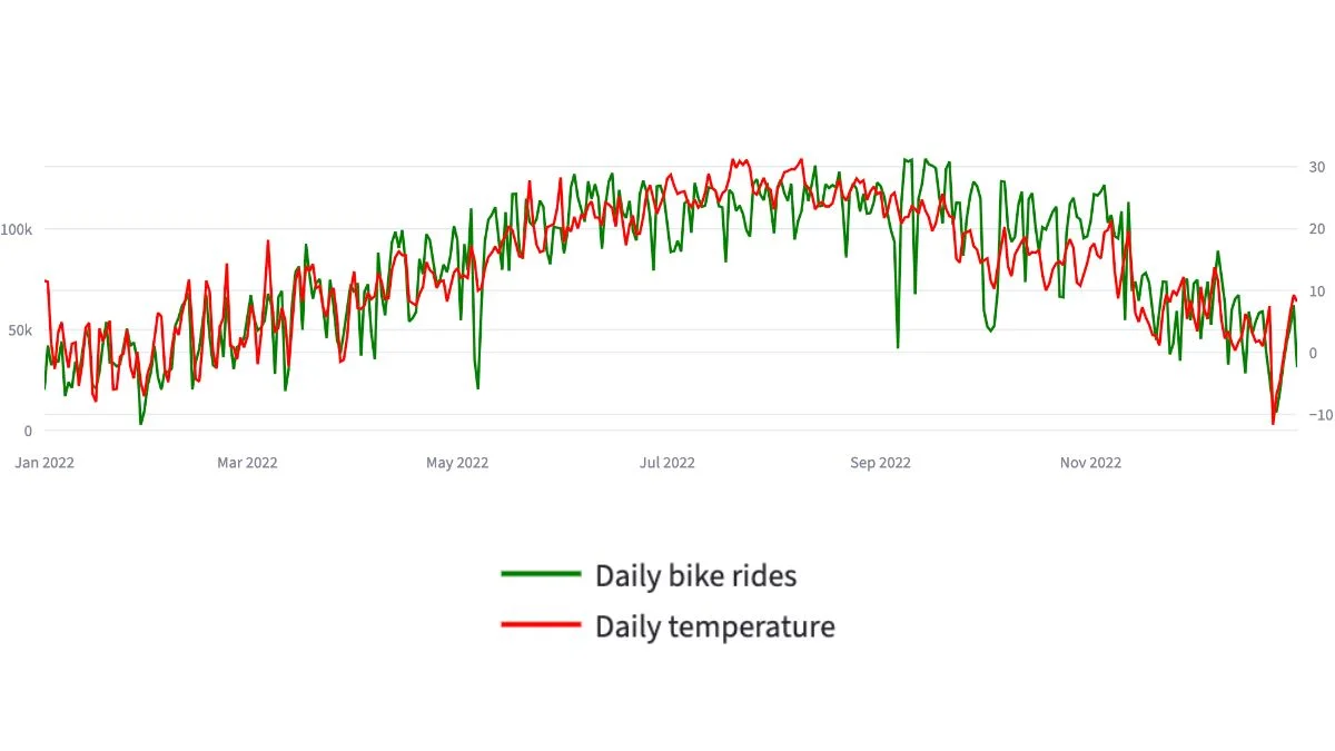
When I worked on a transport analytics case study using a full year of New York bike share data, the correlation between daily trips and average temperature came out at around 0.85. For context, 1.0 means perfect correlation. So temperature alone explained the vast majority of the variation in daily demand. The busiest day in the dataset (14 September, 22.9°C) saw nearly 50 times more trips than the quietest day (29 January, -4.8°C). Same business. Same city. Different weather.
That kind of swing exists in most operator businesses too. Restaurants see it on rainy Saturdays. Multi store retailers see it during heatwaves. Booking businesses see it in cancellation rates. The signal is there. The dashboard usually doesn’t show it because nobody bothered to add the weather column.
What Weather Data Integration Tells You That Nothing Else Can
Three specific things, and they’re all decisions:
Whether a bad week is your fault or the weather’s fault. This is the big one. Without weather data integration, every drop in numbers gets blamed on something — usually staff, marketing, or competition. Half the time, the weather did it and nobody noticed. The other half, you have a real problem and weather was not the cause. Either way, you stop guessing.
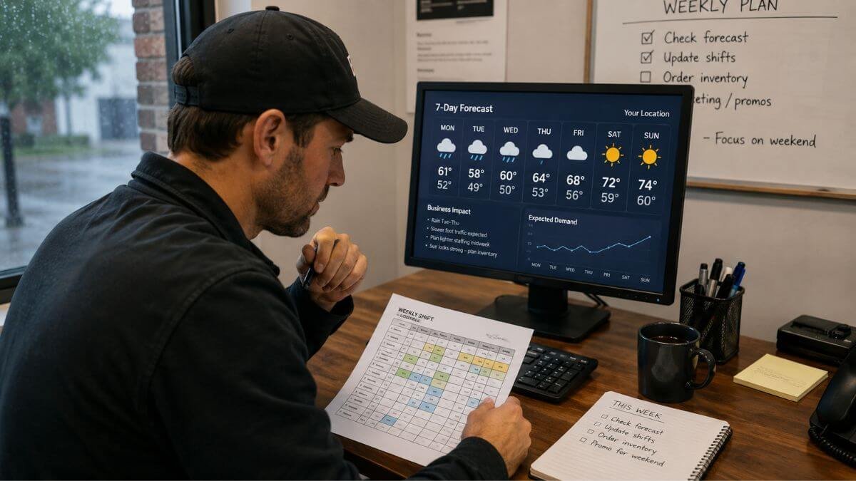
When to schedule more or fewer staff. Most staffing models are based on day-of-week averages. Tuesday at 3pm gets two staff because Tuesdays at 3pm usually need two staff. But Tuesday at 3pm in 34-degree heat is not the same as Tuesday at 3pm in pouring rain. Once you can see the weather pattern alongside your foot traffic or order volume, staffing decisions get sharper.
How to plan stock, capacity, and operating hours for the season. The summer-vs-winter swing in most businesses is bigger than people realise until they look at it on one chart. Once it’s visible, the operational plan starts to write itself. You stock less, staff less, and operate leaner in the quiet months, and load up before the busy ones.
What Weather Data Actually Looks Like
You don’t need exotic data sources for this. Most operators use one of two free options.
The first is NOAA (the US National Oceanic and Atmospheric Administration), which offers a public weather API with decades of historical data and current conditions from weather stations worldwide. If you can name the closest airport to your business, NOAA probably has data from a weather station nearby. You can read more about NOAA’s climate data services on their official site if you want to see what’s available.
The second is your local national weather service. In Australia, that’s the Bureau of Meteorology. In the UK, the Met Office. Most of them offer free historical data downloads in CSV format.
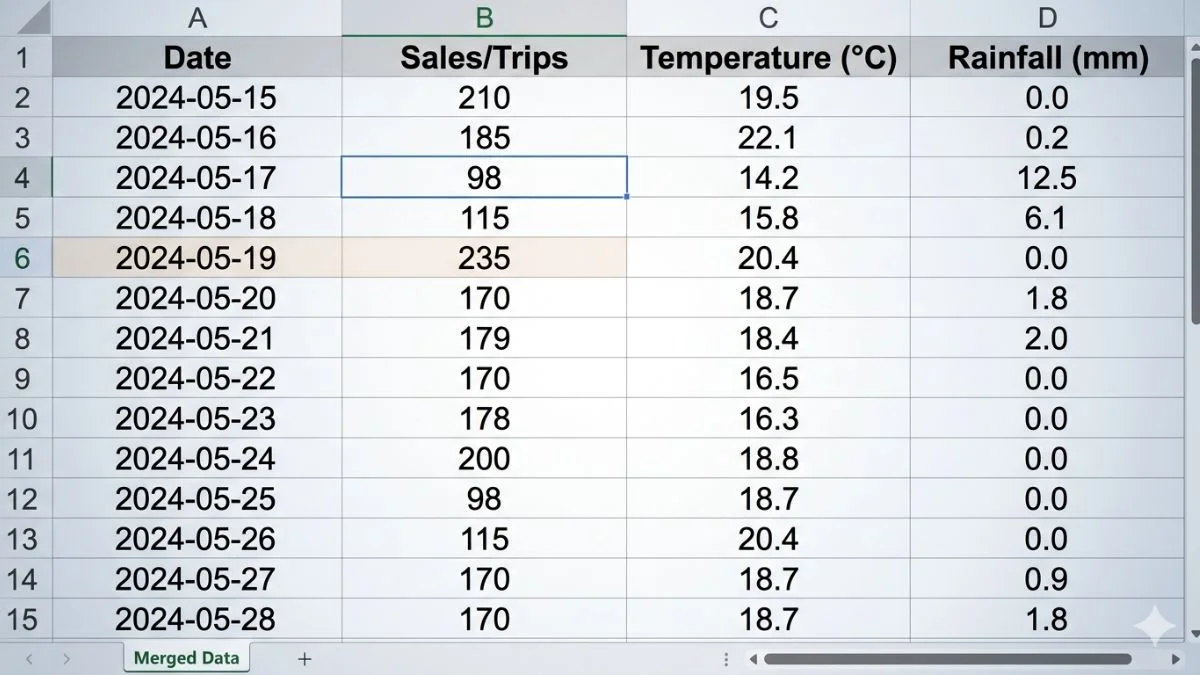
What you actually get is a list of dates, each with a few weather measurements next to it: high temperature, low temperature, rainfall, sometimes wind speed. That’s the raw material. The integration step matches each date in that file with the same date in your business data.
The Workflow In Plain English
Here’s how the integration actually works, step by step, with no code:
Step 1. Decide which weather measurements matter for your business. For most operators, daily average temperature and total rainfall do 90% of the work. Don’t start with twelve variables. Start with two.
Step 2. Find the nearest weather station to your business. For a single location business, this is one weather station. For a multi location business, you’ll want one weather station per region, because Sydney’s weather is not Melbourne’s weather.
Step 3. Pull the historical data. For most businesses, two years of daily records is plenty. That gives you a full annual cycle plus a comparison year. Save it as a spreadsheet.
Step 4. Match it to your business data by date. Every day in your sales file gets a temperature and a rainfall number next to it. This is the actual integration step. In practice, it’s a spreadsheet join or a database merge, five minutes of work once the data is in.
Step 5. Add it to the dashboard. The simplest version is a chart showing daily revenue (or trips, or bookings) as bars, with temperature as a line overlaid on top. The overlay tells you almost everything you need to know within 30 seconds of looking at it.
Once the weather data is flowing in, the next decision is how to move from clean files to a working dashboard: this CSV to dashboard workflow walks through that step end to end.
That’s the whole workflow. The hardest part is usually deciding which weather station to use, not the analysis itself.
If you’d rather not run this yourself, weather data integration is one of several data services I offer, and it usually sits inside a wider dashboard build rather than as a standalone project.
A Small Unit Conversion Warning
If you pull data from a national weather service, watch the units. Some sources publish temperature in tenths of degrees, so a value of “229” means 22.9°C, not 229°C. I once spent ten minutes wondering why my analysis showed New York had hit two hundred degrees in September before realising what was happening. Fahrenheit vs Celsius is the other common trap. Sort the units first, before anything else.
This is small, but it’s the kind of thing that breaks weather data integration projects on day one if you skip it.
What The Integrated View Actually Shows Operators
The first chart most operators want to see is the simplest one: daily business volume as a bar chart, daily temperature as a line on top of it, twelve months of data.
What you almost always see is two things layered together. A long, slow seasonal curve, usage going up as temperature rises through spring, peaking in summer, falling away through autumn. And short, sharp dips on individual cold or rainy days, even in good months.
The slow curve tells you about annual planning. Hiring, leasing, stock orders, marketing campaigns, all of these should follow the curve, not the calendar. The sharp dips tell you about daily and weekly operational decisions. Should we cut a shift tonight? Should we delay the delivery? Should we expect light foot traffic this Saturday?
Both signals come from the same chart. Both are invisible without weather data integration.
How Weather Data Integration Changes Specific Operator Decisions
For a multi location retailer, the integrated view turns staffing schedules into something defensible. “We’re cutting the Tuesday afternoon shift because the forecast is 34°C and on the last six 34°C days we did 40% less foot traffic” is a much stronger conversation than “let’s just play it by ear.”
For a transport or delivery operator, it turns route planning from a routine into a responsive system. Driver allocation, vehicle stocking, and dispatch timing all shift when bad weather is in the forecast. The companies that already do this didn’t invent anything clever, they just connected the weather forecast to their existing dashboard.
For a hospitality business, it explains the no show rate. Some no shows are customer behaviour. Some are weather. Knowing the difference changes whether you tighten the cancellation policy or invest in covered outdoor seating.
For an e-commerce business, even online sales move with weather: heatwaves boost certain categories, cold snaps boost others, and rainy weekends drive more shopping from home. The integration lets you plan marketing spend around real demand patterns rather than guessing.
In each case, weather data integration doesn’t deliver a new tool. It just makes an invisible variable visible, and visible variables can be planned for.
What Weather Data Integration Won’t Do For You
Let’s keep this honest. Weather is one variable among many. It explains a lot of the noise in your week, but it won’t explain everything. Customers churn for reasons that have nothing to do with weather. Promotions still matter. Local events still matter. Word of mouth and competitor activity still matter.
What weather data integration does is remove the weather variable from the rest of your analysis. Once you can see what the weather did, you can finally see what the rest of your business did. The signal in your own data gets cleaner. That’s the real value, not predicting the weather, but explaining the business better by accounting for it.
A lot of operators expect weather data integration to be predictive. It’s mostly explanatory. The predictive use cases (forecasting next week’s demand from next week’s forecast) come later, after you’ve built up enough integrated history to spot the patterns.
When Weather Data Integration Isn’t Worth It
Honestly? If your business is genuinely indoor, climate controlled, and serves a fixed audience that comes regardless of weather, the integration probably won’t move much for you. A B2B SaaS business has very little weather exposure. A medical clinic with booked appointments isn’t strongly weather-driven (although no how rates often are). A subscription business with auto renewal doesn’t care about Tuesday’s rain.
But for any business where customers physically move, decide on the day, or buy on impulse, weather data integration is one of the highest leverage additions you can make to a dashboard. The cost is low (free public data, a few hours of setup), the upside is sustained (the data only gets more useful as it accumulates), and the operational decisions it sharpens are the ones you make every single week.
The Simplest First Step
If you want to test whether weather data integration would help your business, you don’t need to commit to anything. Pull 90 days of weather data for your nearest station. Lay it next to your last 90 days of sales or bookings in a spreadsheet. Plot both on one chart.
If the two lines move together, you’ve just found a planning variable you didn’t know you had. If they don’t, you’ve ruled it out cheaply.
The Citi Bike case study walks through the full year of demand data alongside daily temperature, including the weather merge, the unit conversion, and how the integrated view turned into operational recommendations. Worth a look if you want to see what the finished version of this looks like in practice.
I build custom operational dashboards for businesses with hidden demand patterns, multi-location retail, transport and logistics, booking-based services, e-commerce, and hospitality. The work starts with the decisions you need to make, not the charts.
See how the dashboard service works → or explore other data services if you’re not sure what you need.
Pingback: Citi Bike Case Study: A Powerful Mobility Dashboard Build
Pingback: Weather and Demand: Why Reports Miss the Biggest Variable
Pingback: Weather Data Integration: A Smart Practical Guide