Most operators already have the CSV files. The POS exports the sales data. The booking system exports the reservations. The fleet system exports the trips. The weather agency exports the daily temperature and precipitation. Everything you need to understand your business is probably sitting in five or six files on a desktop somewhere.
What is missing is the path from those files to a dashboard that actually answers a question.
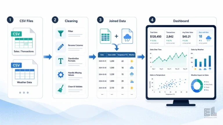
This article is a step-by-step CSV to dashboard workflow, written for an operator rather than a developer. The example throughout is built around weather data: how you take raw sales or trip data, join it with weather data, and end up with a dashboard that shows how weather shifts demand. The same workflow applies whether you are using Power BI, Tableau, Looker, or a custom build.
Why a CSV to dashboard workflow needs to be defined before you start
The most common mistake operators make is opening the CSV in Excel, glancing at it, and starting to chart. That works for a single file question. It falls apart the moment you need to join two data sources.
A CSV to dashboard workflow is the upfront decision about what question you’re answering, which fields you need from each file, and how the files will join. Once those three decisions are made, the rest of the work is mechanical. Skip those decisions and the dashboard fights you at every step: joins break, dates do not match, and granularity mismatches force you to redo the whole thing.
For a weather focused dashboard, the question is usually some version of: “How does weather change our demand pattern, and where in the operation does that show up?” That question forces a specific CSV to dashboard workflow, daily grain weather joined to daily grain operational data, with the join key being the date.
If the question is sharper, such as “Does temperature predict demand at the location level?”, the workflow has to add location as a second join key. The workflow has to add location as a second join key, and the weather data needs to be regional rather than national. Define this before you touch the files.
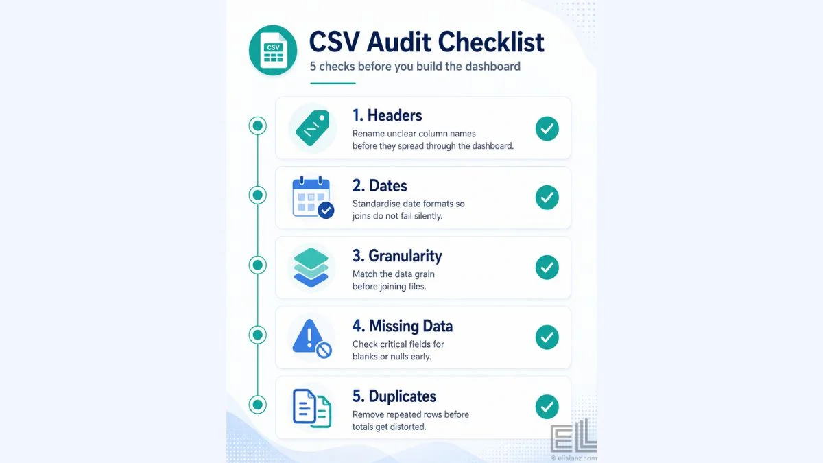
Step 1: Audit every CSV before you load anything
Before any data goes into a dashboard tool, every CSV gets opened in a text viewer or Excel and audited. The audit is the cheapest and most important step in the entire CSV to dashboard workflow.
Five things to check, in order.
Headers. Are the column names usable? POS exports often have headers like “Trans_DT” or “Loc_Cd_03” that nobody will understand inside the dashboard. Rename them at this stage, before they propagate.
Date format. This is the most common failure point in any CSV to dashboard workflow. US format dates (MM/DD/YYYY) and international format dates (DD/MM/YYYY) look similar but parse differently. If your sales data is in one format and your weather data is in another, half your joins will silently fail. Pick one format, convert everything, and document it.
Granularity. Is the file at the transaction grain, daily grain, or aggregated higher? Weather data is usually daily. Sales data is usually per transaction. You can’t join those directly, you have to aggregate sales to daily before the join works.
Missing data. Open the file and look at the first hundred rows, then jump to the middle, then the end. Empty cells in critical columns will break aggregations later. Decide how you’ll handle them now, not when a chart breaks.
Duplicate rows. Especially common in transactional exports where systems retry. A daily total that’s silently doubled is one of the hardest dashboard bugs to spot. Run a duplicate check on the unique transaction ID before loading.
This audit takes thirty minutes per file. It saves several hours of dashboard debugging later.
Step 2: Stage the data in a clean intermediate format
The next step in the CSV to dashboard workflow is staging, moving from raw CSV to a cleaned, standardised version that the dashboard tool will read.
The staging step does three things. It standardises date formats, renames columns into labels operators can understand, and aggregates the data to the grain you will actually use.
For the weather focused example, this means:
The sales or trip file gets aggregated from transaction grain to daily grain. The columns get renamed to plain language, date, location, trips (or revenue, bookings, whatever the operational outcome is). Dates get standardised to ISO format (YYYY-MM-DD).
The weather file gets a parallel treatment. Columns get renamed to date, temperature_avg, precipitation_mm, weather_condition. Dates get standardised to the same format as the sales file.
I do this in Power Query when the destination is Power BI, in dbt or SQL when the destination is a database, or directly in Python when there’s enough complexity to justify it. The tool matters less than the discipline. Never skip staging. Going from raw CSV straight to dashboard is how you end up rebuilding the dashboard three weeks later.
Step 3: Join the operational data and the weather data
With both files staged and at the same daily grain, the join is straightforward. You’re joining two daily files on a single date column.
Two practical notes that catch operators out.
First, the join should be a left join from the operational data, not an inner join. If the weather file has a gap on a specific date, which can happen because of sensor outages or API quirks, an inner join will silently drop that day’s sales data from the dashboard. A left join keeps every operational day and shows the missing weather as null. That is what you want: you can see the gap and decide whether to fill it or leave it.
Second, if you’re working at the location grain, you need to decide how to attach weather to location. The cleanest approach is a location-to-weather-station lookup table, a small CSV mapping each store, route, or station to its nearest weather observation point. Mapping operational locations to nearby observation points is the same approach used by transport research groups like NACTO when correlating mobility data with environmental conditions. This adds a step to the CSV to dashboard workflow but it produces much more accurate analysis than using a single national weather series.
For the Citi Bike work I did, the project breaks down station level demand and the daily weather data that explains the seasonal pattern. The station-to-weather mapping was the step that made the analysis actually accurate, rather than just plausible.
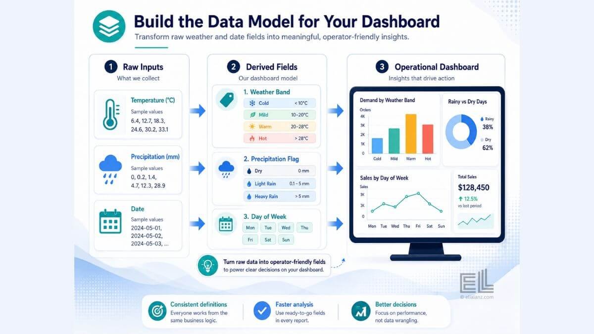
Step 4: Build the data model in the dashboard tool
Once the joined dataset exists, the next step in the CSV to dashboard workflow is the data model, the relationships and calculated fields the dashboard tool needs to render the right charts.
For a weather focused dashboard, three calculated fields usually do most of the work.
A weather band. Bucket temperature into labels operators can understand, cold (below 10°C), mild (10–20°C), warm (20–28°C), hot (above 28°C), or whatever bands match the business. This makes weather vs demand comparisons readable. Continuous temperature scatter plots look impressive but operators don’t use them.
A precipitation flag. This can be a simple two or three level field: dry, light rain, or heavy rain. Same logic. Operators want to compare “rainy days vs dry days,” not run regressions.
A day-of-week field. This is the variable that competes most directly with weather. A Saturday in the rain might still beat a Tuesday in sunshine. Adding day-of-week as a slicer lets the operator separate weather effects from baseline weekly patterns.
These three fields turn a raw joined dataset into something that produces a useful dashboard. Without them, you have data; with them, you have insight. The principle of separating what already happened from what predicts the next outcome applies here. The lagging vs leading indicators piece covers the broader version of this distinction.
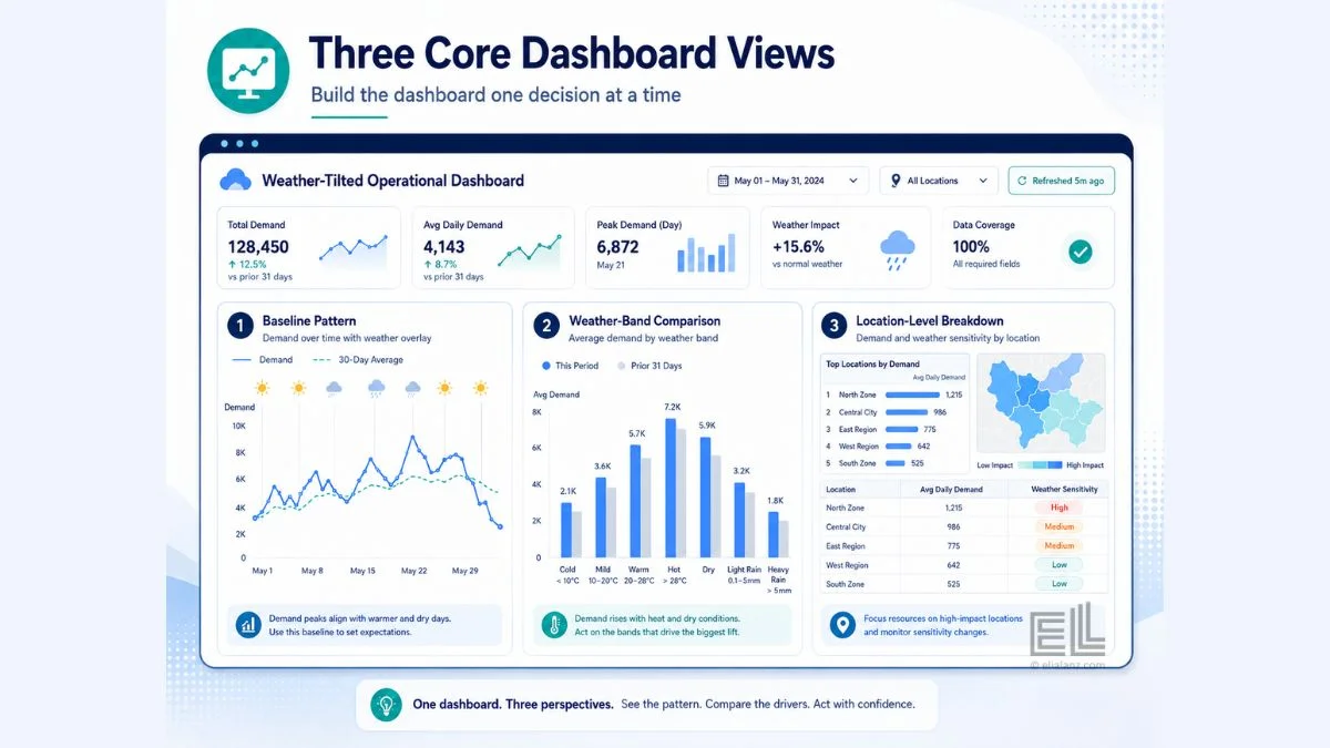
Step 5: Build the dashboard, one decision at a time
The final step in the CSV to dashboard workflow is the dashboard itself. The mistake here is building too many charts. A dashboard isn’t a gallery, it’s a decision tool. Every chart needs to answer a specific question the operator has.
For a weather focused operational dashboard, three views are usually enough.
The first view is the baseline pattern. Demand by day, with the weather condition overlaid. This shows the operator the relationship between weather and outcome over the full data window.
The second view is the weather band comparison. Average demand per weather band, broken down by day of week. This lets the operator see how weather actually shifts the weekly rhythm, whether a hot weekend underperforms a mild one, whether rain hurts weekdays more than weekends, and so on.
The third view breaks demand down by location. Demand by location, filtered by weather band. This is where the operational decisions live, which locations are weather sensitive and which aren’t, which locations need staffing adjusted on a forecast, which routes need rebalancing under specific conditions.
That’s it. Three views, built on a properly staged dataset, will outperform a fifteen chart dashboard every time. The CSV to dashboard workflow is finished when the operator can answer their original question without having to scroll.
Where the workflow usually fails
In every project I’ve done, the CSV to dashboard workflow fails for the same three reasons.
The audit step gets skipped because the operator wants to see charts fast. The dashboard gets built, the date join silently drops half the data, and nobody notices until a manager asks why August looks empty.
The staging step gets skipped because the data “looks clean enough.” Three weeks later, the operator wants to add a new location. The CSV has a slightly different schema, and the entire dashboard breaks because there was no cleaning logic to point to.
The data model step gets rushed because the dashboard tool will let you chart raw fields. The dashboard works for the first question but can’t answer the second or third, because the calculated fields that would have supported them were never built.
These aren’t technical failures. They’re discipline failures. The CSV to dashboard workflow exists exactly to prevent them. Every step you skip shows up later as a problem that’s three times more expensive to fix than it would have been to do right the first time.
What this workflow buys you
A dashboard built through a proper CSV to dashboard workflow does something a quick and dirty dashboard can’t. It tells you, with confidence, that the patterns you’re seeing are real. The joins worked. The dates lined up. The aggregations are correct. The weather data matches the right operational dates at the right granularity.
When the dashboard then shows you that rainy Saturdays at three specific locations are 22% softer than dry Saturdays, you can act on it. You can adjust staffing, rebalance inventory, or shift marketing. The decision is grounded in data you trust because the workflow that produced it was disciplined from the first CSV onwards.
For a deeper dive into how operational data integrates with weather sources, the weather data integration guide covers the inbound side of the workflow: what to pull, where to pull it from, and how to keep it current.
If you’d rather not build this yourself, the dashboard service i offer does the full CSV to dashboard workflow on your data: audit, staging, model, and dashboard build. Or explore the other ways I work with operators if a full dashboard isn’t quite the right starting point.
Elia Lanzuise builds custom operational dashboards for businesses with hidden demand patterns, multi location retail, transport and logistics, booking based services, e-commerce, and hospitality. The work starts with the decisions you need to make, not the charts.
See how the dashboard service works → or explore other data services if you’re not sure what you need.
Pingback: Citi Bike Case Study: A Powerful Mobility Dashboard Build
Pingback: Weather Data Integration: The Best Way to Boost Efficiency