Freeway network performance built for operational decisions
An end to end SQL and Power BI reporting project that turned 1.49 billion roadside detector observations into a four page operational dashboard with site level pressure, peak period patterns, directional load, and a site relative congestion proxy that tells a transport operations team where and when to focus monitoring.
From 87.5M raw detector rows to operational priorities
The project was built around a practical operational question: where, and at what times, is the freeway and arterial network running slow relative to normal, and which locations are worth monitoring first?
Business problem
A transport operations team has 15 minute detector data streaming off the network, but raw it is not decision ready. The goal was to convert 87.5 million observations into clear, defensible signals of operational pressure that support monitoring, operational response and planning, without overclaiming what detector data can show.
Final output
The final deliverable was a four page Power BI dashboard fed by a curated SQL reporting layer: an aggregated fact table, dimension views, and business logic summary views, every headline figure reconciled to a single anchor.
The dashboard helps stakeholders see the busiest corridors, the slowest sites relative to their own normal, the westbound AM / eastbound PM flowing pattern, and a clear set of monitoring priorities.
How the analysis was built
The SQL work converted raw detector observations into a reconciled, dashboard ready reporting model; the main proof of the project was inside a hard 10GB database constraint.
A site relative pressure proxy, not an absolute threshold
Different roads carry different speed limits, so a fixed cut-off is meaningless across a mixed freeway and arterial network. Anchoring each site to its own off-peak normal makes the comparison fair and defensible.
How the slow-running proxy works
Speed is captured in 31 bins, so the proxy works on bin distributions rather than continuous speed, and it never claims measured delay or travel time reliability.
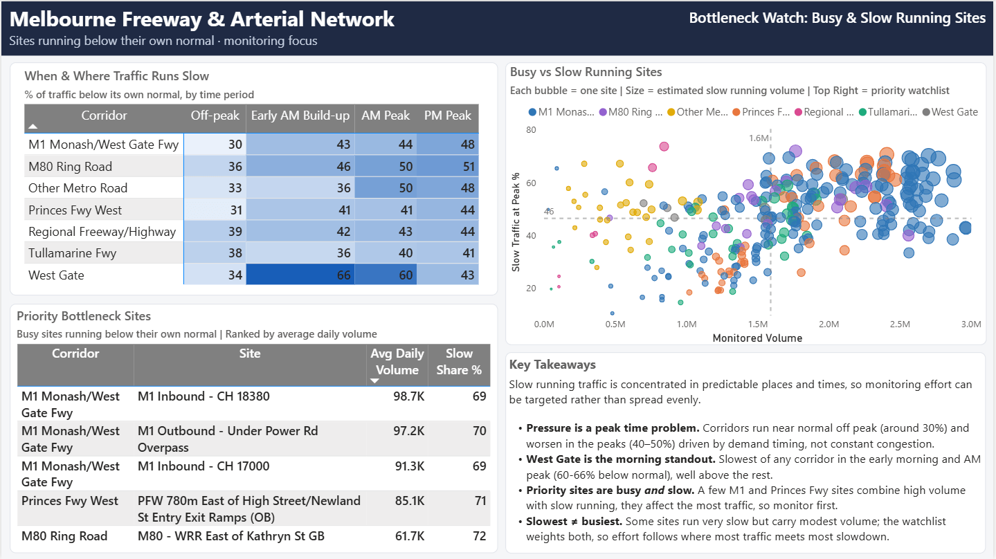
71.9% of traffic running below its own normal speed at peak, the worst site on a relative basis.
70.6% slow running at peak. Second worst relative to its own baseline.
Sites 166, 25 and 173 top the monitoring priority score, which blends volume rank with slow running.
The slowest site is not always the one to act on first, a busy and moderately slow site can matter more.
The network at a glance
Headline cuts of the network, all reconciled to the same 1.49-billion-vehicle anchor.
Coverage
Active detector sites by corridor.
- M1 Monash / West Gate Fwy158
- Princes Fwy West46
- Tullamarine Fwy35
- Other Metro Road26
Vehicle mix
Austroads classes; Heavy = classes 3-12.
- Light84.8%
- Heavy14.8%
- Unclassified0.5%
Demand by day type
Average daily volume across the window.
- Weekday17.66M
- Weekend15.41M
- Holiday13.41M
Peak split
Weekday non-holiday; afternoon-dominant.
- PM volume~222M
- AM volume~131M
- Busiest hour4pm
Dashboard pages built around stakeholder questions
The report moves from a high-level network overview into site, direction, peak-pressure, and recommendation detail.
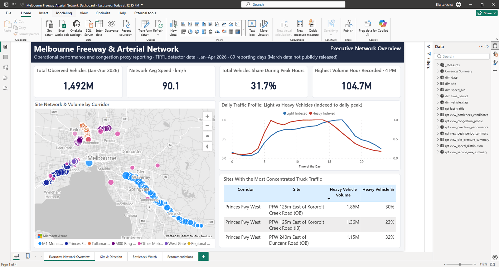
Executive Network Overview
Total volume, volume-weighted average speed (90.1 across the network), peak-period split, top pressure locations, and a map.
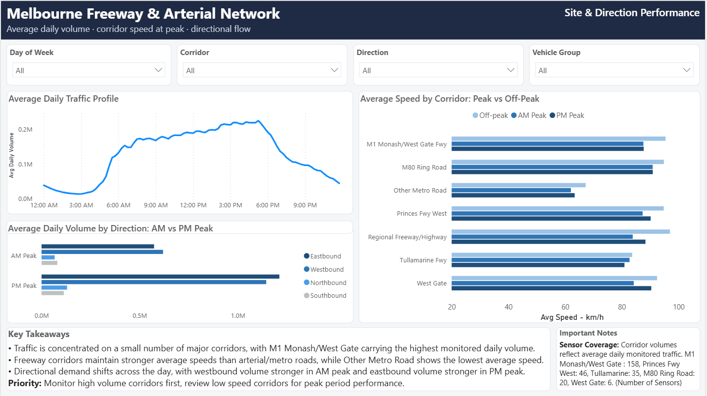
Site & Direction Performance
Site rankings, the westbound-AM / eastbound-PM tidal pattern, speed and vehicle-class profiles, and bottleneck candidates.
Peak Period & Operational Pressure
Weekday vs weekend vs holiday, the volume-speed relationship, and a congestion proxy heatmap by site and time.
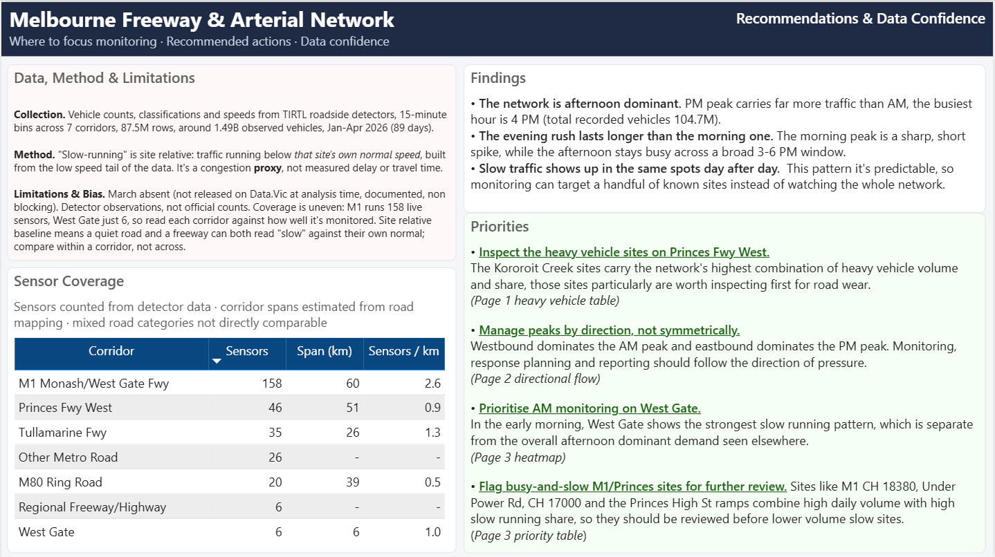
Recommendations & Data Confidence
Three prioritised actions, a coverage-density table, and a plain statement of method and limitations.
What the data made clear
The dashboard turns 87.5 million observations into a small number of decisions an operations team can actually act on.
On a weekday non holiday basis, PM volume (around 222M vehicles) runs well above AM (around 131M), and the busiest hour is 4pm, with average speed barely differing between the peaks, so the load is about volume, not breakdown.
Westbound leads in the morning, eastbound in the afternoon, a modest but consistent signal that maps cleanly onto a direction aware operational response.
The proxy first flagged the whole network as under pressure at 6am. Validated against free flow, morning peak and afternoon peak conditions, it proved to be demand onset, not congestion: so it was separated into its own build up period and the formal peak kept honest.
Corridor level heavy share is flat (around 15% everywhere). Cross referencing heavy volume against heavy share at site level isolated one location near Kororoit Creek Road carrying around 1.86M heavy vehicles at roughly double the network share, framed as an inspection candidate, not a wear claim.
Reconciled end to end, with an honest method
An operational dashboard only holds up if the totals tie out and the metric is honest about what it does and does not measure. Both were built in from the start.
Numbers you can defend
The headline figures are not taken on trust; they are reconciled, and the method is stated plainly in the dashboard itself.
An aggregated fact table (20.85M rows) plus dimension and business logic views feeding Power BI, the raw 87.5M row table is never loaded.
Per site off peak baselines and a low speed share computed across 297 active sites and every 15 minute interval.
Executive overview, site direction performance, peak period pressure, and recommendations with data confidence notes.
Volume, volume weighted speed (90.1), peak split, and heavy share, all tying back to the 1.49B vehicle anchor.
How an operations team could use the dashboard
Manage peaks by direction: align the operational response to the westbound-AM / eastbound-PM tidal pattern instead of treating peaks as uniform.
Start the morning response on West Gate: it shows elevated slow-running early in the day against roughly 50% elsewhere.
Send engineering attention to busy-and-slow ramps: the M1 and Princes ramps carry high daily volume at around 70% of traffic running below their own normal speed.
Stay in lane: capital decisions, new detectors and corridor investment were deliberately left out as a network operator call, not an analyst’s.
What this project demonstrates
SQL data engineering at scale within hard storage limits, dimensional modelling, a defensible site relative method, Power BI dashboard design, reconciled DAX measures, and the ability to turn raw operational data into prioritised, defensible actions.
Need the full portfolio or resume?
Download the PDF portfolio for a polished overview of the projects, or open the resume for the formal career summary, tools, and work history.